
Mobile devices have taken over the internet for a while now, which is why search engines like Google have been pushing their mobile experience over desktop computers.
Why all the fuss over mobile search?
It turns out Google has a very valid reason for focusing on mobile users first, as mobile browsing accounts for nearly half of all web traffic worldwide.
First, there was Google’s Mobilegeddon algorithm update that took place in 2015 – which emphasized the importance of a mobile-friendly website – especially if site owners wanted to maintain their high SERP rankings.
After that, Google began to roll out mobile-first indexing in 2021, where the mobile version of each website would get indexed first.
This led to the prevalence of responsive design, where a website can adequately display on both mobile devices and desktops by altering its dimensions.
Yet, simply using a responsive web design doesn’t mean that you’re fully optimized for mobile. Instead, it’s simply the first step toward true mobile-friendliness, as mobile optimization is an entire SEO (search engine optimization) category of its own.
Customer behavior and browsing habits have changed quite a bit in our current era. As of 2020, mobile visitors spent 90% of their time in apps instead of mobile browsers. It’s also more common for users to engage in an omnichannel experience – where they may begin a task on their phone but finish it on their tablet later.
Read on to learn how to optimize for mobile devices correctly.
What Makes Mobile Optimization Different?
Mobile optimization has come a long way in recent years, evolving from maintaining two separate versions of a website (desktop and mobile) to one responsive website that can handle both.
With mobile-first indexing, the Google Core Web Vitals test got thrown into the mix, which tests a website’s load speed, interactivity, and responsiveness.
That meant a mobile-friendly site had to load everything quickly and flawlessly onto a smaller screen, which posed unique challenges. For instance, image files that may load effortlessly on a desktop can have longer load times on mobile sites – so you may need to compress them.
Then there’s the challenge of the type of content you display on mobile screens.
Think about this; would you want to read and fill out an extensive 5-page sales form on your mobile phone? Or would you prefer to deal with a condensed version that’s only a few sentences?
These are the types of considerations you need to make when designing mobile content. The more that you can make things quicker, easier, and more convenient for your users, the better.
However, there’s a fine balance involved here, as you don’t want to completely ignore users visiting the desktop version of your site, which may appreciate more in-depth content.
That’s why the most powerful tool you have when designing a responsive website is a solid understanding of your target audience and customer journey.
The more familiar you are with your buyer personas, the easier it will be to predict their browsing and buying habits.
Micro-Moments & Omnichannel Experiences: How Consumer Habits Have Changed
Back in the day (think the early 2000s/2010s), most searches were conducted by users sitting at desktop computers either at home or at the office.
For instance, if someone wanted to learn about products from an eCommerce brand, the entirety of their user experience would take place behind their desk – diligently reading product descriptions, user reviews, and watching videos. After a while, they’d make a purchase, still from their desk.
Smartphone browsing and shopping was definitely a thing, but it was far more limited than it is today (partly because most websites didn’t correctly display on mobile devices and didn’t have apps).
Things are not the same in the 2020s, and that’s primarily due to the prevalence of mobile devices, time-saving mobile apps, and responsive websites. Also, applications like Venmo and Apple Pay made it much easier to make purchases on the fly without having to memorize your debit card number.
We now have a world where any query or task can be answered or completed anytime, anywhere, in an instant.
With the world at our fingertips, we’ve become accustomed to answering any question or solving any problem within seconds – which has led to the prevalence of what Google calls micro-moments.
It’s also increasingly common for users to start an experience on one device and finish it on another – such as starting product research on their phone and finishing it later on a tablet, which is an omnichannel experience.
What are micro-moments, and why do they matter?
Google defines a micro-moment as ‘a moment where a user turns to a device to act on an immediate need, either to know, go, do, or buy.’
You likely experience several micro-moments each day without even realizing it.
As an example, say you hear the word ‘patina’ on television and don’t know what it means, which prompts you to whip out your phone and type the term into Google to find a quick definition.
That’s an example of an I-want-to-know micro-moment, as you had a brief moment of highly targeted search intent where you wanted to learn something new. Google was there to help you, and they provided the definition you were craving (if you were curious, patina is a greenish-brown film that forms on bronze and other metals, such as the Statue of Liberty).
Googling a restaurant for user reviews or directions is another form of micro-moment, an I-want-to-go moment.
Here are the different types of micro-moments:
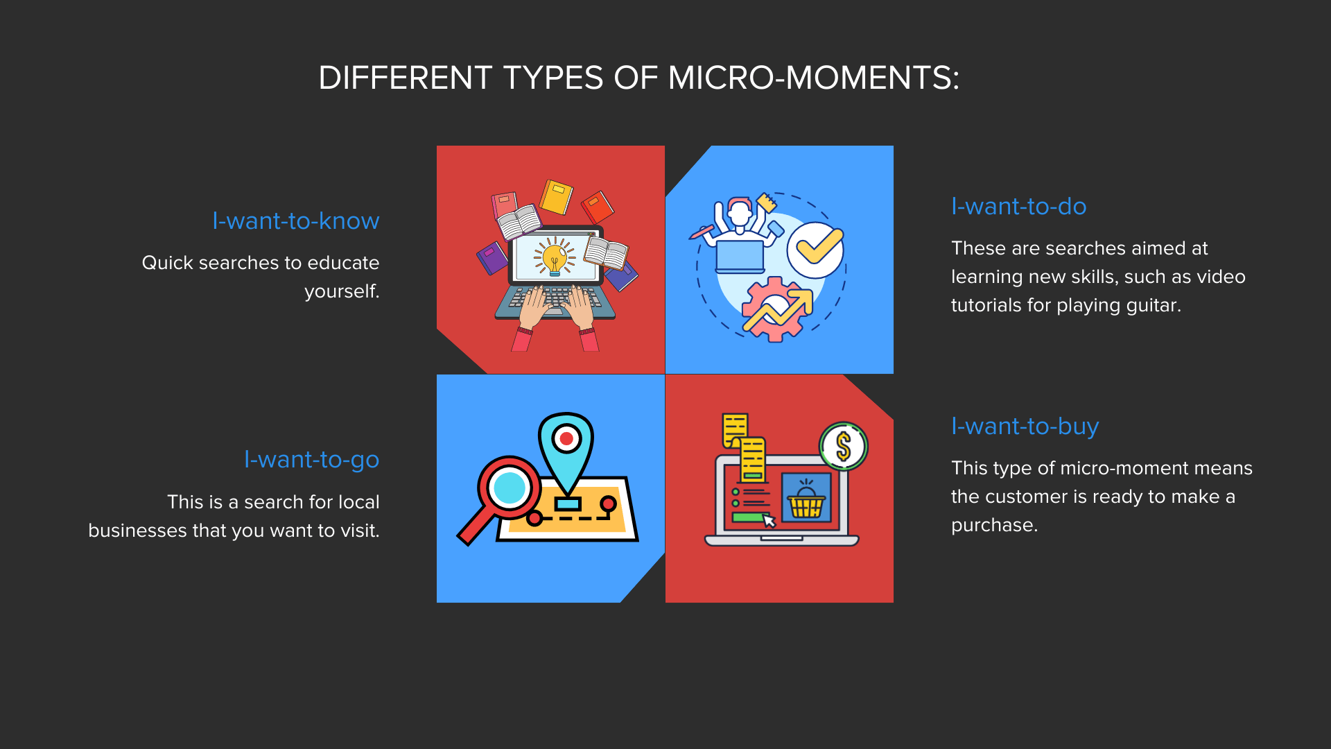
- I-want-to-know. Quick searches to educate yourself.
- I-want-to-go. This is a search for local businesses that you want to visit.
- I-want-to-do. These are searches aimed at learning new skills, such as video tutorials for playing guitar.
- I-want-to-buy. This type of micro-moment means the customer is ready to make a purchase.
As you can see, micro-moments occur all the time, and figuring out ways to capitalize on them is essential if you want to learn how to optimize for mobile devices.
Why are omnichannel experiences important?
Do you only use your smartphone to browse the web? Or do you use a combination of your phone, desktop computer, tablet, smartwatch, and other devices?
The fact is that most internet users juggle several different devices during their busy day. Activities such as blog reading, online shopping, and booking appointments often occur across several devices.
That’s why all your content needs to be responsive enough to handle this demand. For instance, let’s say a user begins reading a helpful blog post you wrote about how to use one of your products on their phone during their subway ride to work.
They mark their spot halfway through, and then continue reading on their desktop PC at work, and then finish it on their tablet during their lunch break.
If your website can’t properly display on one of these devices, you’ll lose a reader and a potential sale.
That’s why it’s imperative to have a mobile-optimized website that flawlessly displays your content, no matter the device. Beyond that, it pays to have a solid understanding of your typical customer’s journey, including which devices they use the most (more on this in a bit).
How to Properly Optimize for Mobile
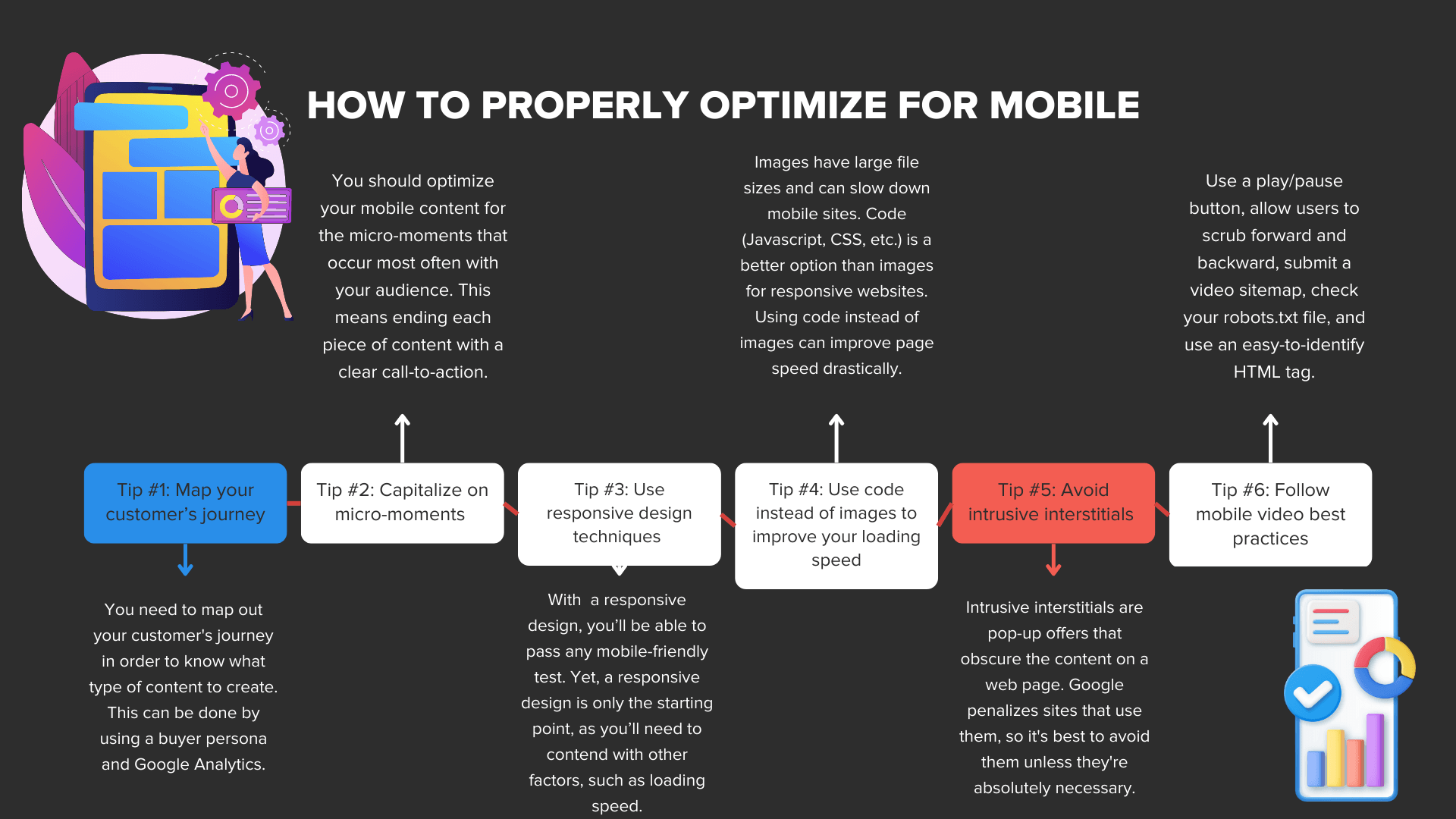
Now that you know how mobile SEO has changed, it’s time to learn how to optimize your site to perfection for both mobile and desktop users.
Optimizing for mobile goes well beyond a responsive web design and should factor in micro-moments, customer journeys, and omnichannel experiences.
Without further ado, here are the most effective tips for developing a mobile-optimized site.
Tip #1: Map your customer’s journey
Does your target customer prefer to browse web pages on their smartphone, tablet, or desktop?
Do they regularly use apps like Uber, Venmo, or Apple Pay?
These are all crucial things to know about your target audience, which is why you need to map out your customer’s journey. Doing so takes a buyer persona, so you’ll need to develop one if you haven’t yet.
To help, check out our guide on how to create a customer avatar that accurately reflects your niche audience.
From there, you can use Google Analytics to discover which mobile devices your audience uses the most. Navigating to Audience > Mobile > Overview will break down which devices your visitors use to view the mobile web.
This report gets very specific, as you can see which users viewed your website on mobile, desktop, or tablet and which specific devices they used.
For instance, you may uncover that a majority of your mobile visits come from smartphones and tablets. Digging further, you find that most users are viewing your content on Apple iPhones and Apple iPads.
You can use this data to map a typical customer’s journey on your website. They may view a landing page on their iPhone but then come back later to make a purchase on their iPad. This insight can help you understand what type of content they’ll respond to the most.
For example, if most users are viewing your pages on an iPhone (that has a smaller screen size), they’ll likely not want to deal with long paragraphs and fine print. As a result, sticking to concise copy and sales forms is best. That’s how you can use your customer’s journey to influence the type of content you create.
Tip #2: Capitalize on micro-moments
Next, you’ll want to optimize your mobile content based on the micro-moments that occur with your content the most.
Do your web visitors flock to you for your educational blog posts and videos?
Then it’s clear they’re having I-want-to-do and I-want-to-know micro-moments, which is driving a ton of organic traffic to you as a result.
Yet, without a convincing call-to-action (CTA), your educational blog post or video won’t impact your conversion rates.
That’s why you should end each piece of content with a concise CTA that lets users know what you want them to do next without beating around the bush.
Do you want your users to sign up for your newsletter? Then make that explicitly clear in your CTA. The same is true if your goal is for users to make a purchase. The worst thing you can be with a CTA is shy, so don’t be afraid to be confident and direct.
You should also set up landing pages to capitalize on I-want-to-buy micro-moments if you haven’t already.
That means focusing on keywords that have a strong purchase intent. If you sell WordPress plugins, then you should target keywords like ‘buy WordPress plugins,’ WordPress plugins for sale,’ etc.
Your goal should be to have mobile pages ready for every type of micro-moment that may occur within your audience, whether they want to learn, do, go, or buy.
Tip #3: Use responsive design techniques
Just because a responsive website design isn’t enough to cover all of mobile SEO doesn’t mean you shouldn’t use one.
In fact, a responsive design is a must for any site that wants to optimize for mobile.
In the past, web admins would have two versions of their website – the primary desktop version and an m-dot website for mobile phones.
Trying to keep track of both is a real hassle, which is why responsive design techniques took over.
What makes a design responsive?
This design style uses ‘media queries’ to define the proper display resolutions. Each different resolution is considered a ‘breakpoint’ from the original, which is the point where the page transitions from one resolution to the next.
You’ll have a resolution for your desktop version, smartphones, and tablets. That way, your website will look the same no matter which device users are on. With a responsive design, you’ll be able to pass any mobile-friendly test.
Yet, a responsive design is only the starting point, as you’ll need to contend with other factors, such as loading speed. If your page doesn’t load fast enough, you’ll fail Google’s Core Web Vitals test and won’t show up in the SERPs, which brings us to our next tip.
Tip #4: Use code instead of images to improve your loading speed
Images have a large file size and tend to hold back the loading time of mobile sites. Even with compression, it’s best to use code (Javascript, CSS, etc.) instead of image files for your responsive website.
For example, instead of using a repeating background image with thousands of pixels, you can code the background. While that may only save a minuscule amount of memory for one image, these optimizations add up.
If you switch all your images to code, you can improve your page speed drastically, which is what you want.
So if you’re having trouble passing Google’s Core Web Vitals test, think in terms of code instead of uploading images.
Tip #5: Avoid intrusive interstitials
Have you ever been browsing a web page only for a screen-sized pop-up offer to appear, obscuring your view of the content you were just reading?
That’s an example of an intrusive interstitial, and they tend to do more harm than good for your users.
Besides interstitials that take up the entire screen, the ones that obscure the top half or bottom of the page are cumbersome as well.
Not only do these rub users the wrong way, but Google doesn’t care for intrusive interstitials either, and they actively penalize them.
Interstitials are only okay if they’re used for legal obligations, such as age verification or letting users know about your cookie usage. Otherwise, it’s best to steer clear of them and rely on ‘Buy Now’ buttons, convincing CTAs, and optimized landing pages to guide your prospects down your funnel.
Tip #6: Follow mobile video best practices
Videos are a highly effective form of content that you’ll likely want to implement. Yet, displaying videos on mobile sites presents some unique challenges.
For one, Google’s web crawlers need some signals in place to properly understand your video and its content.
Next, you must ensure that your videos are accessible to the public. If you’re going to embed videos from your YouTube channel, then your privacy settings must be set to public; otherwise, your users won’t be able to view your content.
Here are the best practices for mobile videos that Google recommends:
- The presence of a play/pause button for users.
- Ensuring users can scrub forward and backward.
- Use custom controls with a div root element, a video media element, and a div child element dedicated to video controls.
- Submitting a video sitemap to Google Search Console to ensure Google identifies your video as a video.
- Checking your robots.txt file to ensure your videos aren’t blocked and can be indexed by search engines.
- Using an easy-to-identify HTML tag to help Google identify your video.
Follow these guidelines, and you shouldn’t have any trouble incorporating videos on your website.
Final Takeaways: Optimize for Mobile
Search engines have evolved in many ways in regard to catering to mobile devices. While mobile sites began as an afterthought, they’ve now become Google’s primary focus.
As such, if you don’t properly optimize for mobile, you risk falling off the SERPs entirely, which will spell disaster for your business.
That’s why you need to follow this guide to ensure your website can cater to any device at any time.
Do you need expert help forming a mobile SEO strategy for your company?
Then you need to drop everything and check out our managed SEO services at HOTH X. Our SEO gurus are also available for consulting, so feel free to book a call today.
Leave a comment