When a user has just entered your website, how do you help them navigate through it and end up with a purchase? How do you encourage blog readers to check out your products?
The answer is call-to-action (CTA) buttons. These are buttons that prompt users, be they leads or customers, to take action rather than linger.
On a SaaS website, for example, an endless feature list is pointless if users can’t sign up or get a demo easily. A well-crafted CTA helps with that.
In this article, we’ve explained the 10 types of CTAs that most websites use and provided real-life examples to showcase how they’re utilized.
What is a CTA?
A call-to-action (CTA) button or link encourages users to perform desired actions on your website. This includes signing up for your newsletter, buying your products or services, and anything else that helps convert them from visitors into leads and then leads into customers.
A CTA can be as simple as a “Sign Up Here” button, a line of text offering a free demo, or a “Read more” button on content. The type of CTA you use depends on the action you want the viewer to take.
An eCommerce website, for example, wants to sell more products, so its landing page can talk about how helpful the product is or the latest sale, while the CTA can use language like “Save Money Now” and lead users to the products page.
Without a call-to-action button, users are left to their own devices after reading your landing page. Often, this leads them to click off rather than search for the sign-up, products, or services page. Consequently, conversion rates take a hit.
10 Most-Used Types Of CTAs With Examples
Brands and marketers can use multiple forms of CTAs, depending on the context and platform.
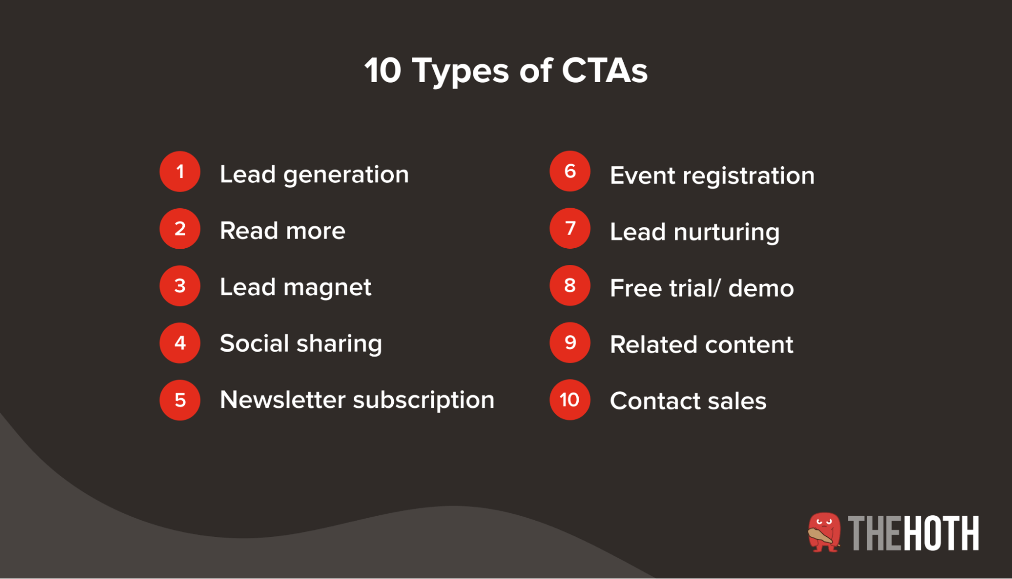
Here are the 10 main types:
#1. Lead generation
Lead generation CTAs aim to convert casual viewers or first-time readers into potential customers. These are essential for your website and a crucial avenue for lead generation.
You can use these CTAs anywhere you expect to get a high number of new visitors. For example, Sendinblue has an “Enroll” CTA button for their online courses that leads users to a detailed course syllabus breakdown and an introduction to the instructor.
Other places to use this call-to-action button are in the sidebar, at the end of blog posts, atop landing pages, or on floating banners. They must be eye-catching and stand out from the rest of the text or images.
Regardless of the length of the CTA, it must tell users exactly what to expect when they click on it. In the above example, a CTA like “Get Started” or “Read More” would not have been as effective.
#2. Read more
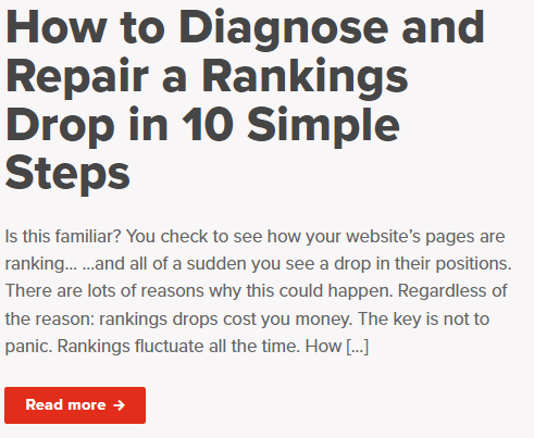
A “Read More” call-to-action button aims to hook readers into viewing one or more pieces of content. It is most commonly used on blog home pages, along with a preview of the post. It gives users the option to read the full post or keep scrolling.
Here’s an example from The HOTH’s blog:
A “read more” CTA lets you display more pieces of content on a single page. It also enables accurate data collection since users have to click on each CTA button to view a single post.
This CTA type can also be used at the end of blog posts to lead users to the next piece and keep them on your website longer.
#3. Lead magnet CTAs
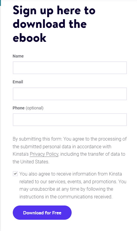
Lead-magnet-focused form submission CTAs are an effective tool to collect user information and introduce customers into the sales funnel by offering insights and research-based data in return. You’ll often see these CTAs before you can download resources from a website.
This CTA type uses lead magnets, such as eBooks, guides, case studies, or reports to gather customer information. Viewers are likely to see this as a fair exchange since they get valuable content in return.
Use actionable CTAs that showcase the content’s value rather than a generic ‘Submit” button. You can take it a step further and include an option to sign up for product updates and the company newsletter. Here’s an example from Kinsta:
Forms like this can also act as a lead qualification tool. It shows that the reader is actually interested in a solution to a specific problem. Some forms are detailed and ask for the user’s profession and company name to immediately qualify them as a lead.
If a marketing manager from a major enterprise fills out a form, you can send them more info on your marketing tool. Similarly, if a student submits the same form, they aren’t a high-priority lead and don’t need to be added to the sales funnel. You can send them emails about any marketing courses you’re offering instead.
#4. Social sharing buttons
Encourage users to share your content via simple social media CTA buttons at the end of your blog posts or landing pages.
These buttons help users easily engage with your brand. All they have to do is click on a button to share the post with their peers or friends.
Your brand benefits from social sharing since many people trust the opinions of influencers or regular professionals in their industry. So, if user A liked and shared your blog post, there’s a higher chance that one of their followers will read it and engage with your brand.
You can also display social sharing icons in the sidebar and include a counter showcasing the number of shares on each platform. This acts as social proof of how helpful the content is.
#5. Newsletter subscription
Email newsletters are a great way for brands to build relationships with their customer base by offering information, discounts, and insights. In addition, marketers can use them to capture email leads and guide users into a drip campaign.
Sure, this is a form of lead magnet, but it can be a harder sell to entice potential leads with. Most people probably already have multiple newsletters in their inbox, and they’re not exactly chomping at the bit to add another one.
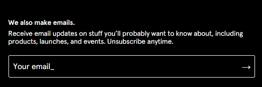
So a plain “subscribe” button won’t do the trick here. Instead, your CTA should include 1 or 2 lines explaining why they should sign up — what’s in it for them. Here’s how Glossier does it:
You can use email subscription CTAs on landing pages, sidebars, product pages, and at the bottom of your website. Make sure it’s easy to see and even easier to sign up.
#6. Event registration
Promote online and offline events on your website to build awareness, encourage sign-ups and gather contact information.
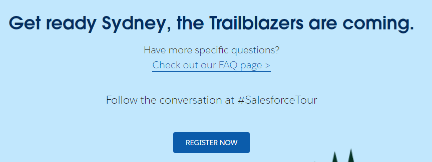
Event promotion or registration CTAs can be added to landing pages, like the one from Salesforce below, or in sidebars and next to blog posts.
You can also use this CTA on the login page to boost ticket sales and place it all over your website to inform leads or casual readers about it.
The placement and text of your CTA also depend on the event and who it is meant for. For example, a generic webinar on marketing best practices in 2022 could interest most of your website visitors (if your blog is about marketing, that is), so it makes sense to include it throughout your website.
On the other hand, a webinar on a highly-specific topic within marketing campaigns, such as technical SEO, is only interesting to some visitors. It’s better to promote these events within blog posts related to the topic of SEO, so you can reach potential prospects who care.
#7. Lead nurturing
Once you’ve captured a lead, you need to nurture them until they complete a purchase and become a paying customer. You can do this using CTAs within your existing communication channels — emails are the most popular choice.
Lead nurturing moves a prospect from the awareness stage in the buyer lifecycle to the consideration stage and maybe even entices them to complete the purchase.
Take this offer from Calm, for example. Anyone who has signed up for the free version of the app is a prospect for their paid plans. The app uses the “40% off” CTA in its emails to nurture leads, drive click-throughs, and boost conversions.
The best lead nurturing CTAs for you depend largely on the context and your goals. You can, for example, encourage users to sign up for a more in-depth course, showcase product features, or offer exclusive discounts to drive sales.
#8. Free trial/demo
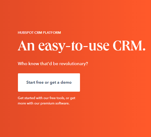
One of the most common CTAs that most people have seen is the “Start free” or “Get a demo” CTA. This is a risk-free CTA, where users explore your product’s benefits and use cases without any financial commitment or credit card details.
This CTA type is built to convince users to get your product and see how useful it really is. Once a lead has the free version, you can upsell the paid plan by showcasing how it can further improve their work processes.
Most SaaS companies use this CTA. Here’s an example from HubSpot:
Of course, the free trial or demo should be mind-blowing enough to make users realize they need your tool to be more proactive or efficient. Once they’ve realized this, a purchase is almost guaranteed.
#9. Related content
Marketers know that the longer a visitor stays on your site, the higher the chances are of them converting. When a user goes from one blog post to another and another, they’ll learn more about your product, learn about the value it offers, see your values as a company, and make the leap to purchase.
This is why related content CTAs are essential. They lead customers down a rabbit hole of different types of content designed to keep them on your website and push them further down the funnel.
Related content CTAs can be included within the content, such as between different sections of a blog post, or in the sidebar, via a simple link.
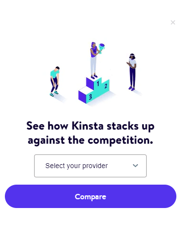
Kinsta improves on a generic related content CTA by integrating it with a comparison tool. This is excellent for both related reading and to help new visitors see the value of Kinsta’s products.
Every blog post has this CTA in its sidebar. When users select a Kinsta competitor and click on “Compare,” they’re led to another blog post that compares the two platforms and explains why Kinsta is better.
This keeps readers on the site for long periods, but it also highlights how great the platform is and tells users why they should trust Kinsta instead of its competitors.
The only issue here is that it also shows up for blog posts that are completely unrelated to WordPress hosting. The more unique and relevant your CTAs (and related copy) are, the more it draws users in.
#10. Contact sales
You need a sales-focused page and CTA to close the deal at the end of your lead-generation and lead-nurturing efforts. This CTA will take customers directly to the “Contact Sales” page so they make the purchase.
But it’s not enough to write a basic CTA like “contact our sales team today.” You have to use the copy around the CTA to create urgency, show the impact or benefits of your product, and build FOMO (fear of missing out). It should make the customer want to buy the product immediately.
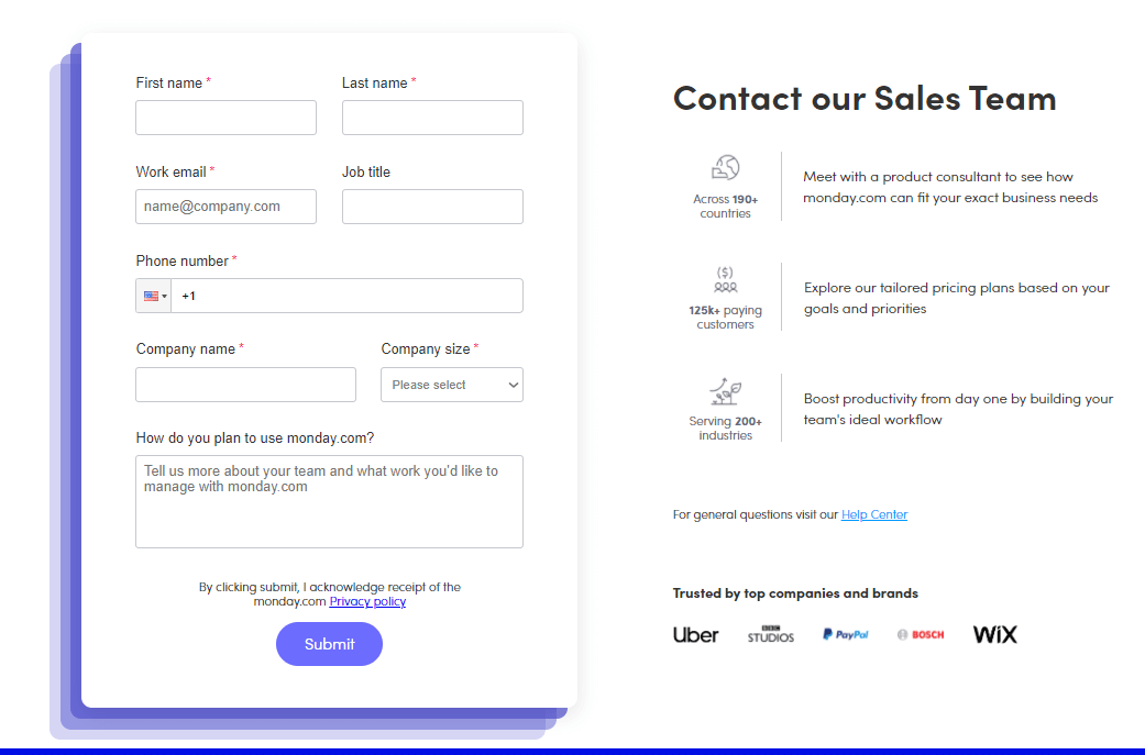
monday.com does this well:
Notice how the copy next to the form highlights social proof of how great their software is? The message here is that it’s helped thousands of companies worldwide, and it can help you too, so why wait? Contact their sales team now.
Drive More Sales With Solid CTAs
CTAs are an essential marketing tool that drives conversions by leading users further down the sales funnel. A well-crafted CTA speeds up the journey from the home page to checkout by eliminating doubt and showing users exactly where to go.
The copy surrounding your CTA is equally important, and the copywriting experts at The HOTH can help you develop both without breaking a sweat. Give us a call today to get started!





Leave a comment