Do you make use of eye-catching visuals and infographics in your blogs, whitepapers, and eBooks?
If not, you should be, as infographics improve reading comprehension by 50%, and content with visuals increases information retention by 78%.
That’s a big deal, especially if you’re in the ever-competitive B2B marketing space – where influencing key decision-makers with insightful content is a must.
In fact, many marketers are using infographics as part of their content marketing for how effective they are at conveying information. If you’re in the B2B space, leveraging infographic design is a must in order to stay competitive.
It’s not just B2B companies either, as infographics work wonders in nearly every industry, including healthcare, education, government, and every type of business.
Infographics are also invaluable for SEO tactics like building backlinks.
There are many different types of infographics, and you’ll need to determine which will work best for your needs. For example, if link-building is your goal, an infographic containing statistics related to your field is a great idea – as other bloggers in your industry will want to link back to it.
If you’ve never created an infographic before, you may not know where to start. Read on to learn about the most popular infographics examples to get your creative juices flowing.
What Makes an Effective Infographic?
An infographic combines visual design elements with essential information like statistics, figures, maps, tutorials, and more. They’re fun and engaging ways to visualize (and skim) vital information.
Infographics have been around forever, with the earliest examples being maps, star atlases, and rock art.
It’s proof that humans have long been visual learners, as we can retain 65% of visual information instead of only 10% of what we hear.
In a nutshell, the goal of an infographic is always to ‘show’ rather than ‘tell.’ Any way you can convey a piece of information visually (through an illustration, chart, or graph) will have more power than writing it as text.
These visuals will make complex information more digestible and help retain your reader’s attention.
That’s why the best infographics use clever graphic design techniques like an appealing color palette, graphs, pie charts, and other visual elements (which can increase readership by 80%).
In fact, the proper use of color in infographics makes readers 80% more motivated to read the content. For example, a step-by-step guide infographic will be easier to digest if each step has bright colors, bold text, and a helpful illustration.
Developing infographics for your content
While infographics have countless benefits, they don’t create themselves. Instead, creating a beautiful infographic takes quite a bit of time and effort.
You should treat creating infographics just as you would a blog post, whitepaper, or eBook.
If you don’t have an in-house graphic designer, you may want to hire one specializing in infographics. There are also infographic makers out there, such as Canva, which makes developing infographics easier for the layperson. Canva even has infographic templates you can customize to create something original.
Like any marketing strategy, you’ll want to consider your target audience‘s needs and business goals before putting an infographic together.
For example, what type of content is your target audience looking for?
Do they want to know how to do something, learn eye-opening statistics, or how to get somewhere?
Knowing this will help you determine which type of infographic will work best for your audience. The next step is to determine how the infographic will help you meet your business goals.
Your infographic should contain highly desirable information for your target audience if you want more traffic. If you’re going to increase conversions, your infographics should cover the benefits of your product and how it will solve customer pain points.
10 Infographics Examples to Spark Your Creativity
Now that you have your audience and goals in mind, you need to settle on a type of infographic to create. There are many different types of infographics out there, so it can seem a bit overwhelming at first.
Yet, these 10 infographics examples cover just about everything, from timelines to comparisons and more. Without further ado, here are some of the best infographics examples you can use for data visualization.
#10: Comparison infographics

Do you want to show how your product is superior to a traditional version? If so, a comparison infographic is what you want.
It’s where you use graphic elements to compare the similarities and differences between two things. It doesn’t have to be a product comparison, either. You can compare careers, financial institutions, and just about anything else.
Comparison infographics work best for:
- Increasing conversions by showing how your product or service beats the competition
- Gaining B2B leads by illustrating how one process compares to another
- Generating traffic by educating readers with an apt comparison of two ideas
The most popular comparison infographic templates feature multi-column layouts, which is ideal for comparing two things. Conversely, there are also comparison chart infographics, which use a visual table for comparisons.
Which type should you choose?
As a rule of thumb, the multi-column layout works best when comparing two things. The table layout works great when comparing multiple items, such as the signup rates for different SaaS platforms.
#9: Statistical infographics
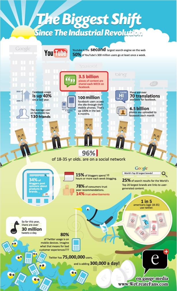
Eye-opening statistics and digital marketing go hand-in-hand. There’s no better way to convince a prospect of something than by sharing a relevant statistic that proves your point (we did it in this article multiple times).
Yet, if you have a lot of statistics to share, typing them out as vanilla text is a sure-fire way to bore your audience and lose readership.
That’s where statistical infographics save the day. Fun colors, typography, graphic icons, and relevant illustrations will make digesting statistics far easier.
You can focus on a single study or include a ton of relevant statistics relating to your subject matter.
Statistical infographics are great for:
- Convincing customers of the effectiveness of a product or service
- Educating readers on essential topics
- Building links by generating backlinks from other bloggers eager to share your statistics
- Building customer trust by sharing accurate, reliable information
Your prospects will appreciate being able to learn lots of vital stats and figures about their niche in one convenient location. If you’re in the B2B field, statistical infographics can help you build trust with your leads, as 52% of B2B decision-makers say they’re definitely more likely to buy from a brand once they’ve read their content.
#8: Timeline infographics
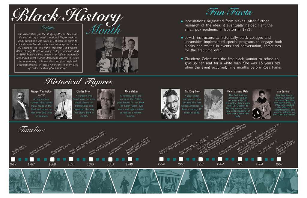
Do you want to take your potential customers on a journey? Then the timeline infographic is the perfect format for you.
A timeline infographic will convey the passage of time to show how things have changed or how one thing leads to another.
Timeline examples include:
- Illustrating the steps of your buyer’s journey
- Educating readers on your company history
- Illustrating how a certain product or service works (if it takes time to start working, such as a weight-loss supplement)
- How to do something (i.e., steps to take care of your cat)
- Displaying a timeline for a project
As you can see, you can do a lot with a timeline infographic. You can use them to educate customers, build trust, and increase sales. They should be your go-to if you want to convey the passage of time.
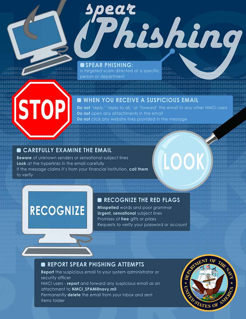
#7: Process infographics

If your goal is to convey how a process works to your readers, you need a process infographic template.
Process infographics make heavy use of flowcharts and diagrams to present information. They’re great for step-by-step breakdowns of how to complete a task, such as how to close down your property at night.
For this reason, process infographics are great for training employees. If there’s a task that your staff struggles with, such as forgetting essential steps in closing down at night – a process infographic can be the remedy.
They can also help simplify decision-making, which is advantageous for B2B companies. You can use a process infographic to let decision-makers know how smooth your operation is, convincing them to try out your service.
Process infographics shine at educating and informing readers, so bear that in mind when considering them.
#6: Informational infographics
If you need to break down a complex concept to your audience, then an informational infographic is just what the doctor ordered.
An informational infographic uses a mix of typography and visual elements to summarize a topic in a fun and engaging way.
These types of infographics tend to rely more on text than others, so they need an appealing color scheme and helpful visuals to break up the information.
Also, it’s pretty common for an informational infographic to be a standalone piece of content. Instead of adding it to a blog post or whitepaper, you can simply let your infographic do all the talking for you.
We’ve done this plenty of times at The HOTH, like with this example of 10 Common Local SEO Mistakes that you can use for design inspiration. As you can see, the infographic is the entirety of the content, and it uses a mix of colors, graphics, and text to convey its message.
Thanks to the quality of our own infographic, it was able to generate 3 dofollow backlinks from other bloggers in our niche. It also concisely lays out common local SEO mistakes, which is helpful information for our target audience.
#5: Geographic or map-based infographics
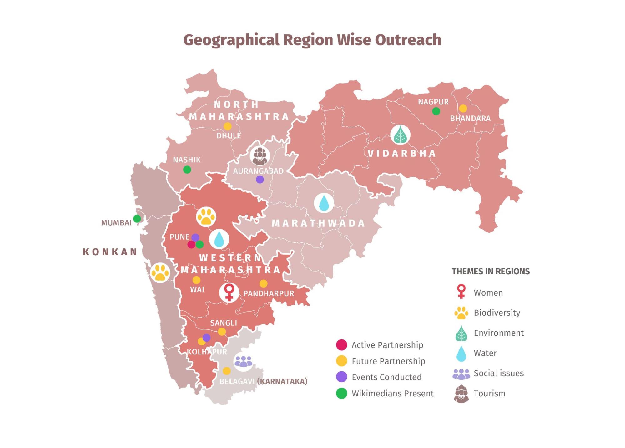
Map infographics are excellent tools for conveying location-based statistics, such as the percentage of homeowners in Georgia based on age demographics.
You can also highlight geographic trends or provide a travel guide for a specific state or region.
If you want to convey information to your prospects that have to do with a specific location, an infographic is one of the most engaging ways to do so.
Your color scheme will matter here more than others, as you’ll want to make heavy use of bright colors on your map to make it stand out. The more visually appealing that you can make your map, the more likely viewers are to engage with it and share it on social media.
#4: Interactive infographics
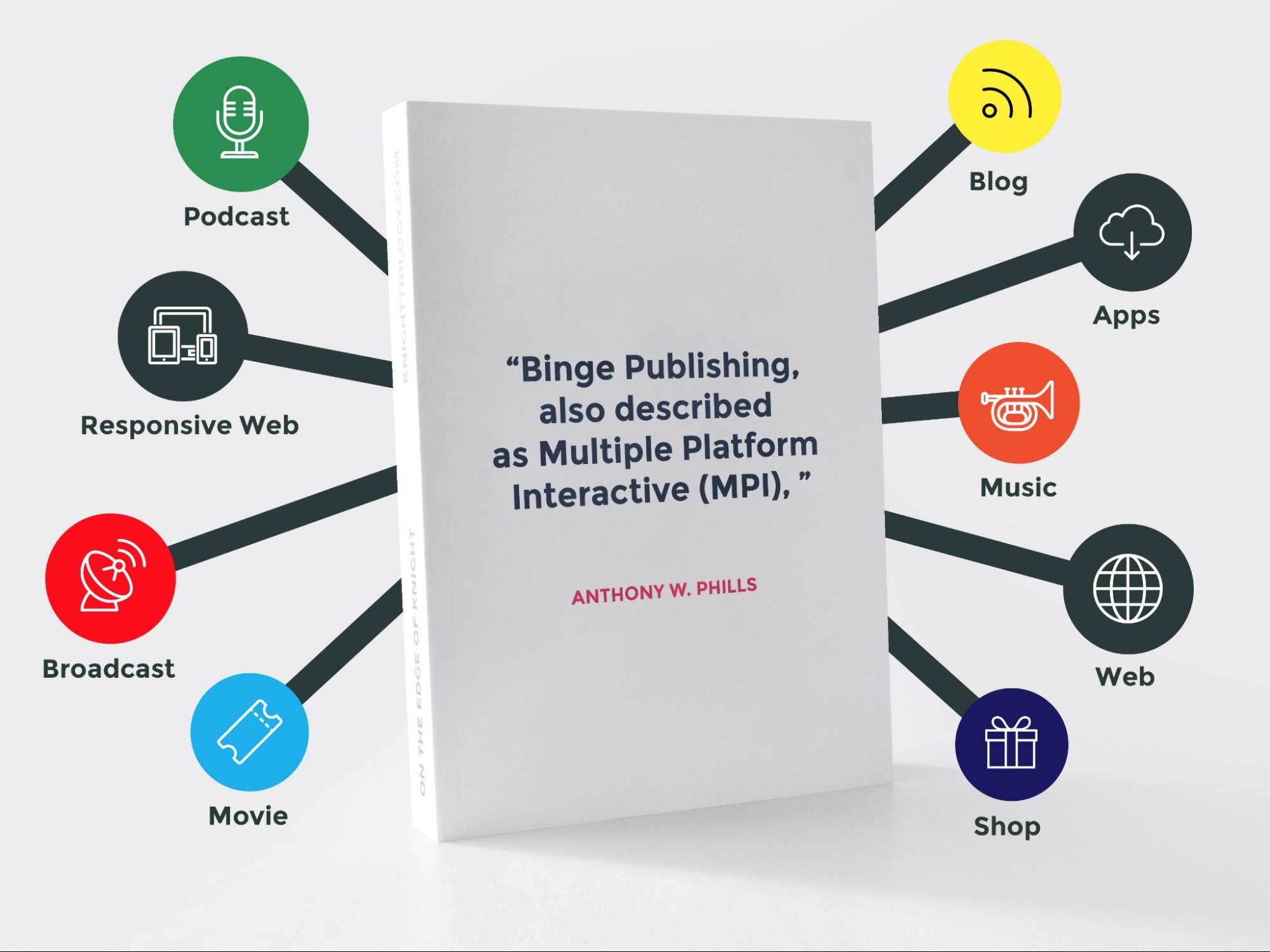
If you have the ability, creating interactive infographics adds extra layers of intrigue and personalization to your content.
What kind of interactivity can you use?
You can develop just about anything with a talented graphic designer by your side. There are moving infographics that use animations and videos based on user interactions.
There are also clickable sections that display information whenever a user interacts with them.
Some infographics even have search bars and filters that users can manipulate to see specific types of information.
Of course, creating an interactive infographic will take more time, money, and effort than a static one, but the results can be worth it. Consider these quick statistics as proof:
- 88% of marketers say that interactive content has helped differentiate their brand
- 79% say that utilizing interactive content improves message retention
- A majority of marketers say that going interactive is the best way to repackage existing content
So if you’re looking for a way to increase your engagement and retention, creating an interactive infographic will help you achieve both.
#3: Anatomical infographics
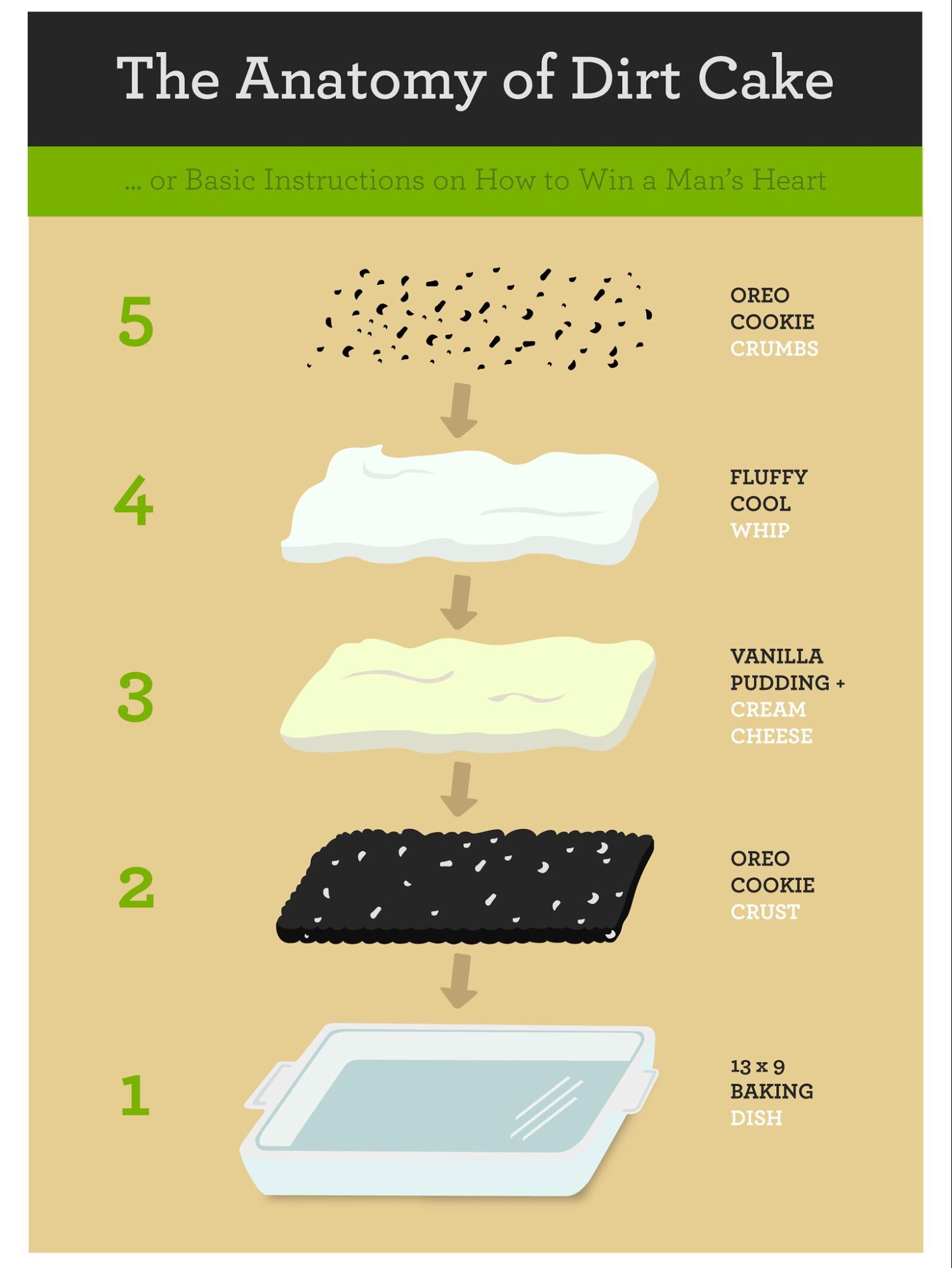
Sometimes you want to give customers a visual representation of one of your products so they can see how all its components work together.
That’s what anatomical infographics are perfect for, and you can use them in virtually every type of industry.
To visualize how they work, think about Anatomy class in school. Instead of breaking down the components of the body, you explain the components of:
- A product
- A service
- A recipe
- Your organization
An anatomical infographic will help your prospects easily visualize a complex process or product, thanks to the clever use of brand colors, illustrations, and typography.
#2: Infographic resume
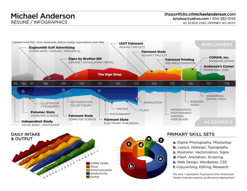
Are you looking for a way to stand out from the crowd when applying to a coveted position? Then you should make use of a visual resume or infographic resume.
Just as infographics spruce up dull blog posts, whitepapers, and eBooks – so too can they enhance career resumes.
Instead of going for the traditional text format, you can include fun illustrations of yourself and your unique skills.
These types of resumes tend to work best for positions that value creativity and innovative thinking. An infographic resume can transform your education, skills, and work experience into a stunning visual story of what you bring to the table as an employee.
#1: Hierarchical infographics
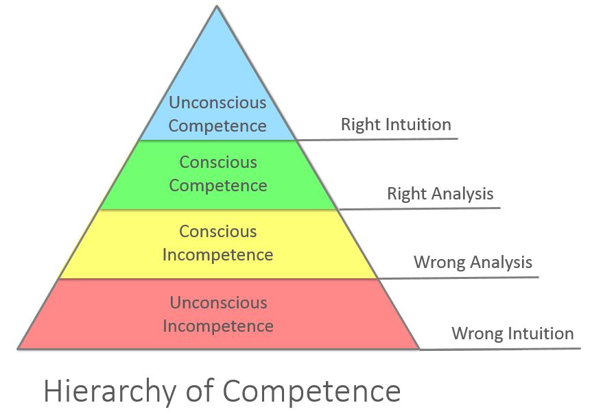
Lastly, you can use infographics to lay out a hierarchy. These types of infographics often take the shape of a pyramid for this reason.
You can use a hierarchical infographic to:
- Break down the employee structure at your organization
- List your products in order of quality, price, and effectiveness
- Educate readers on a hierarchical process at your company
If you’re onboarding new employees, a helpful infographic going over the hierarchy at your company can be a big help. Also, don’t forget to use colors and illustrations to make your hierarchical infographics as appealing as possible.
The Importance of Infographics in SEO
If you’re engaging in a content marketing/SEO campaign, you’re missing out on a massive secret weapon if you don’t use infographics.
They’re the fourth most common type of content found in digital marketing strategies, and it’s not hard to see why.
The first and most apparent is how an infographic enhances content and makes it more digestible. If you’ve got a lot of complex information to cover, including just one infographic can make a massive difference to the amount of traffic you generate with the post.
Infographics for link-building
Earlier in the post, we mentioned that one of our infographics was able to generate 3 backlinks for us. That was no mistake, as it was one of our goals all along.
Infographics are backlink-generating powerhouses due to their tendency to go viral.
That’s why you should create infographics for this very reason. If you want to boost your domain authority significantly, building a robust backlink profile is the way to do it. The ‘link juice’ that you generate from backlinks can grant you a noticeable boost to your search engine rankings.
To create an infographic that generates backlinks, ask yourself what other bloggers in your space are looking for the most.
Do they need science-backed statistics to help sell their products, or would an anatomical breakdown of a product provide more value?
You’ll want to do some research to pinpoint which type of infographic would work best for your needs.
Concluding Thoughts: Infographics Examples
By now, you should have a better understanding of the effectiveness of infographics. You should also have a sense of which types of infographics will work best for your content.
We covered 10 common infographics examples, but that doesn’t mean that’s everything an infographic can do.
In fact, there are countless ways you can use the infographic format to convey information, so don’t limit yourself to this list.
Do you not have the time to come up with ideas for infographics? If so, don’t wait to check out HOTH Blogger, our professional blogging service where we write engaging posts that you can transform into infographics.
Leave a comment