
Do you want great looking, easily sharable, white label reports for your clients?
Great news – The day is here!
For the last 3 months, we’ve been working diligently on dramatically improving our reports.
As of today, we’re rolling out our brand new reporting on most products, and you’ll see even more in the coming weeks.
In the past, we have traditionally focused on just executing the deliverables, but now our reports will better reflect the effort we put into the production process.
With our new and improved reports, we wanted to tackle 3 major areas:
- Ease of Use & Shareability
- Style Continuity & All-In-One Reporting
- Process Transparency & Value
In this post, I’ll break down exactly what’s changing and the thought process behind these changes.
Let’s get into it!
1. Improving Ease of Use & Shareability
Ease of Use & Access
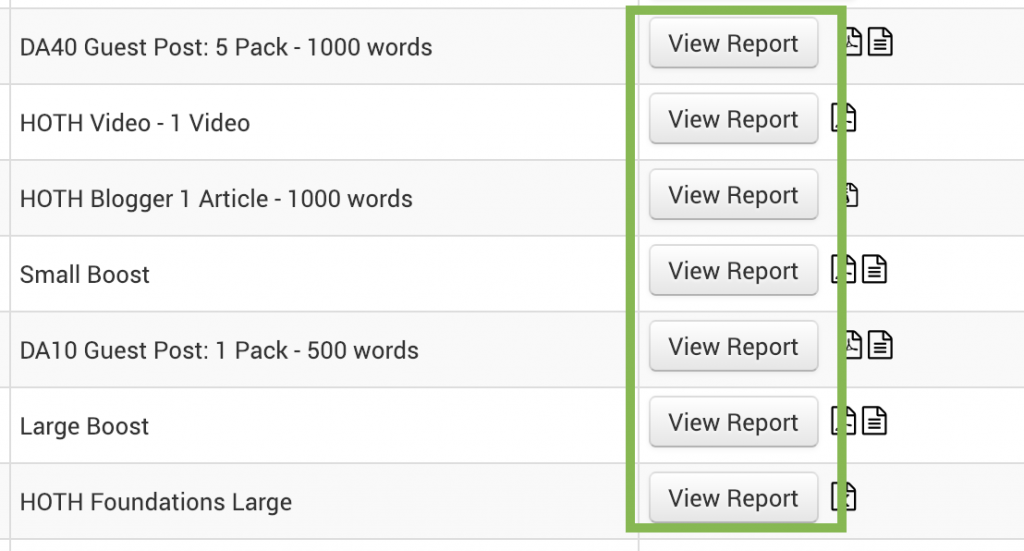
The first thing we wanted to tackle was the ability to access the report information without having to download a PDF or open excel.
Now you can click 1 button on your dashboard and instantly access your report in live HTML format – no downloads required!
Easily Share Your Reports
In addition, you’ll notice that the URL of the report is a white label – meaning you can instantly share this with a client without any connection to The HOTH. Each report URL is generated with a unique hash.
Here’s an example:
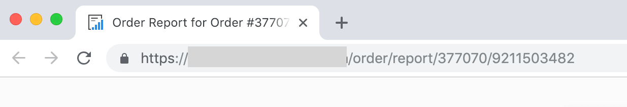
Just copy the link and share it with whomever you want!
2. Style Continuity & All-In-One Reporting
Next, we wanted to tackle the disjointed nature of current reporting.
Style Continuity
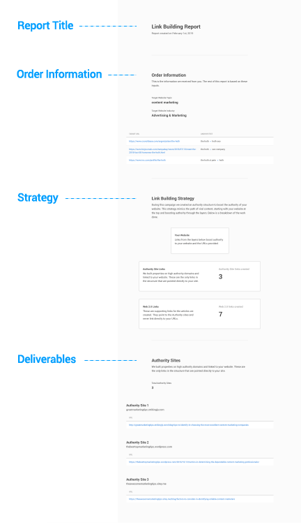
We wanted to bring style and organizational consistency to the reports, so each report follows the same outline:
- Report Title
- Inputs
- Strategy
- Deliverables
In addition, we used the same style on each report to create consistency. You’ll notice it’s still unbranded / white label.
Here’s an overview of a complete report:
All-In-One Reporting
One of the issues that we face is that some formats work better than others depending on the type of data you are displaying.
For instance, when you have a lot of “small” data, a spreadsheet works best.
Other times, we need to display larger amounts of data or even multiple formats of content like blog articles, pictures, or even videos.
This resulted in having different formats for each report, from .pdf, to .txt to .xls, etc.
We wanted to achieve both the ability to create the entire report in one accessible format as well as get continuity in style, so we used HTML.
HTML reports allow for flexibility – displaying tables, text boxes, images, and interactive content.
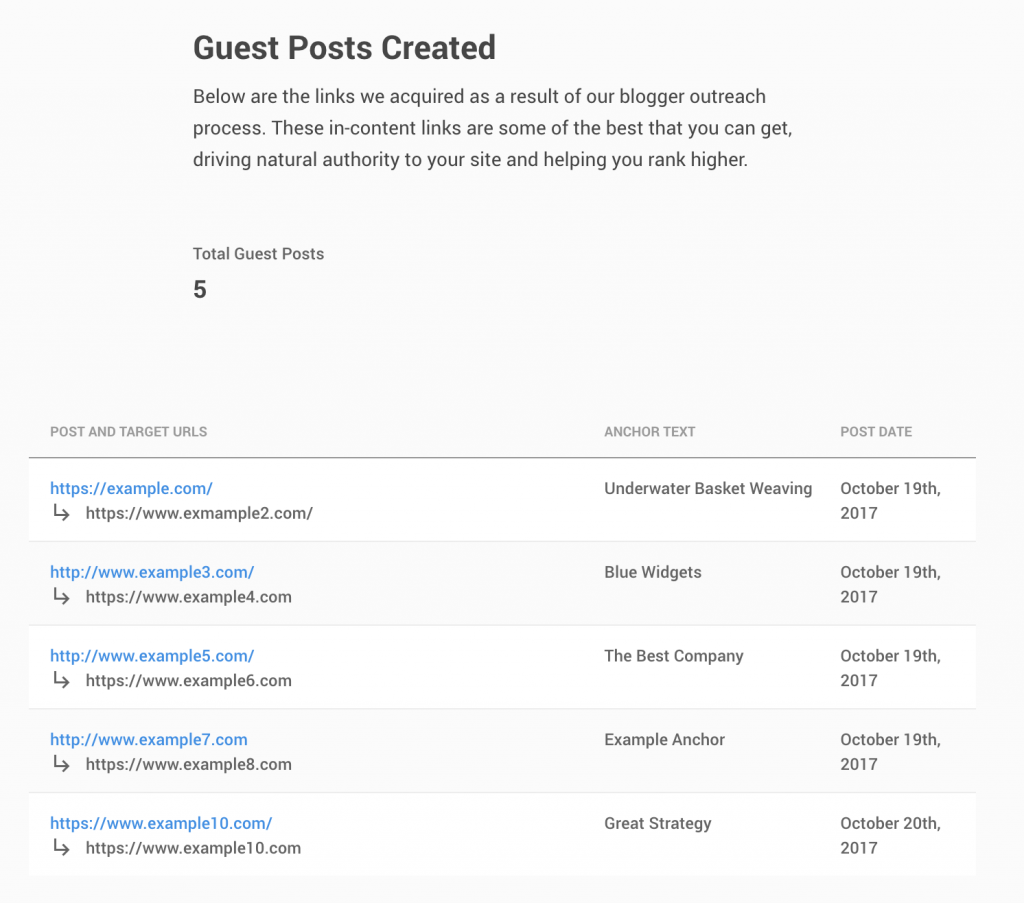
Example for a Guest Post table:
Example displaying long form content:
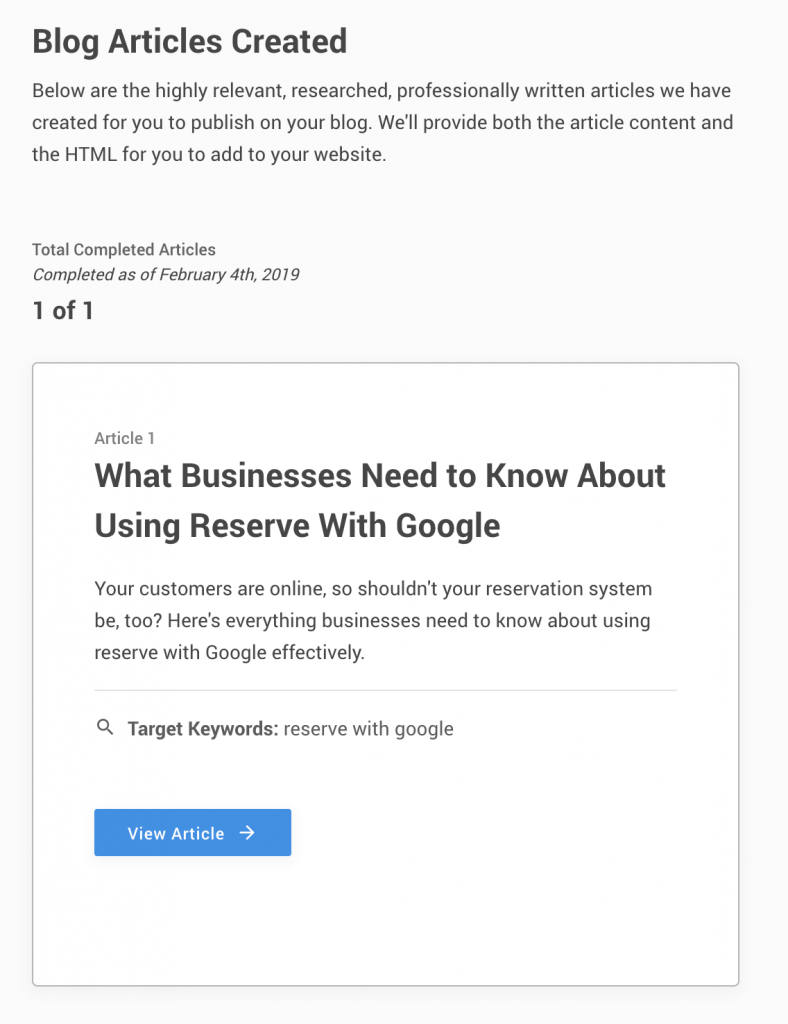
This standardization of reports should allow for much better ease of use & consistency.
3. Process Transparency & Value
Often when clients would get a report, it would be hard to understand the value of the deliverable.
Whereas a simple link deliverable had gone through a large production process, it was difficult to understand what you were looking at.
We often heard reactions like “What am I supposed to do with this?”
To help solve this, we included a section called “Strategy” in every report that goes through the process that each deliverable went through and what it means.
Example video strategy section:
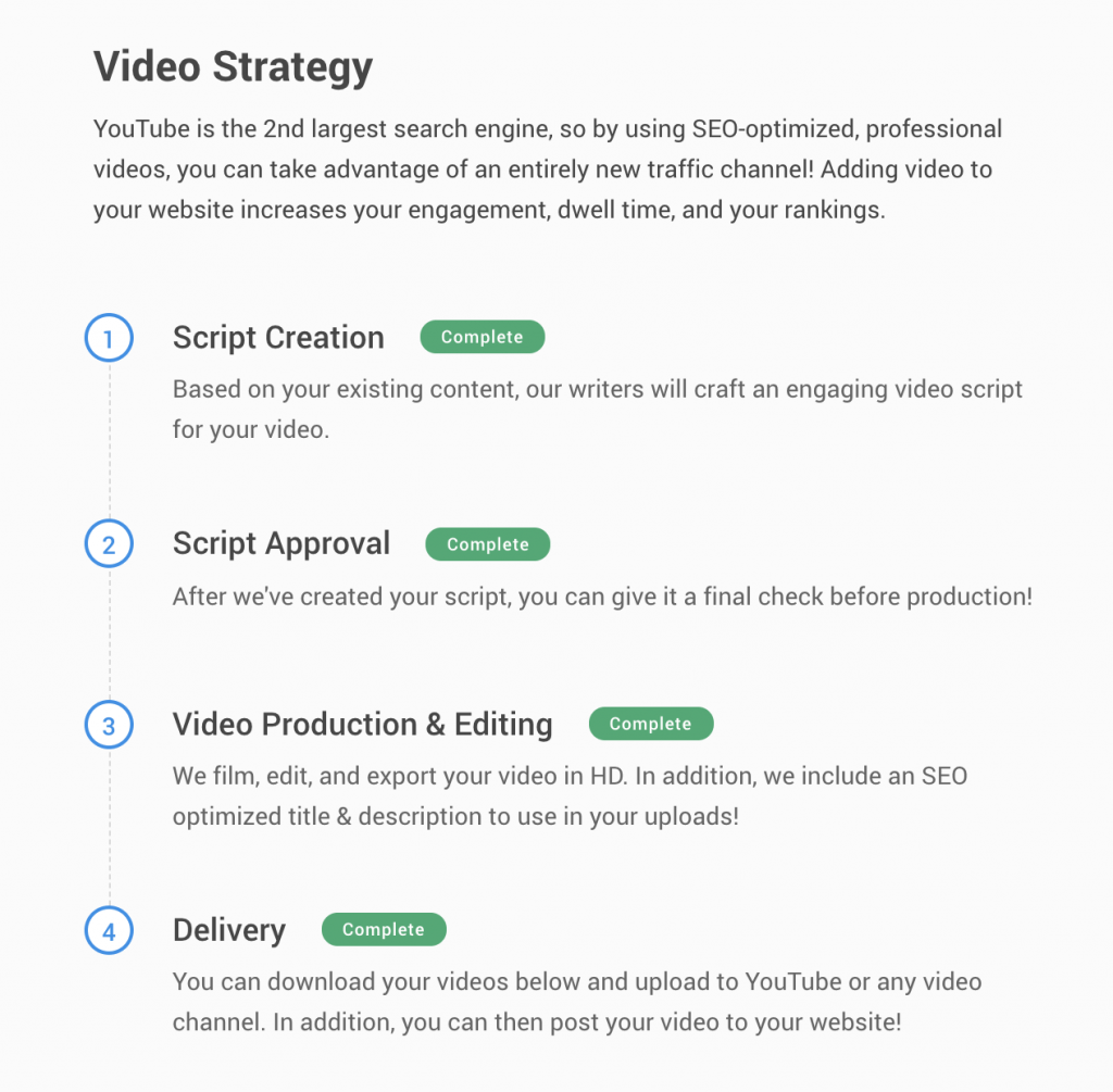
This allows clients to see the process and value of each deliverable and provide context to what the deliverable actually is & what to do with it.
Conclusion
Inside of your client dashboard, you will be able to view your new product reports live and up to date.
Take a minute to login and let us know what you think!
Leave a comment