


Quick Links
With 36.6%, infographics are the second most used visuals, and 84% of marketers, who used infographics in the past, claim they are effective.
With that said, let’s discuss some of the different types of infographics you can use in your content strategy right now!
Ready to begin? Let’s go!
What Information Should an Infographic Include?
Infographics are a great way to simplify length or complex data.
You want your audience to be presented with visually appealing images.
You want your readers to understand what they are looking at right away.
That’s why it’s always best to include descriptive titles and subheadings.
Additionally, infographics should include the following:
- Good graphics
- Valuable information
- Relevant and current data
Here are some other key components to great infographics:
- Do keyword research
- Your target topic
- Informative statistics
- A bold and appropriate color scheme (check out the color wheel for guidance)
- Attention-grabbing graphics
- Keep your infographic organized in a sequential story
- Specially format your facts
What Colors Should an Infographic Include?
Infographics should be a part of your content marketing, as it is the fourth most used type of content marketing.
In fact, infographics and other visual content can increase website traffic by up to 12%. That’s one reason why 65% of businesses use infographics for marketing purposes.
With that said, a monochromatic color palette is best for infographic designs, especially if it reflects your brand.
Here is some information you may want to know before designing your infographic:
- Color or hue
- Value (lightness and darkness)
- Tint
- Shade
- Tone
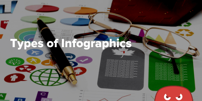
What are the 8 Different Types of Infographics?
As you begin to learn how to make data visualization infographics for your brand, you’ll soon realize that certain types of infographics can help communicate different types of data and information to your target audience.
Not only do infographics boost your organic traffic, but they can also boost your SEO efforts and increase your online presence on different social media platforms.
For example, comparison infographics can help your audience understand different aspects of different products or services.
Here are 8 different types of infographics you can use in your content marketing strategy:
Statistical infographics
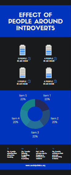
If your relevant niche uses visualization survey results to present data from multiple sources or back up an argument with data, then you may want to consider creating a statistical infographic.
A statistical infographic uses your data as the main focus. The layout and visuals can help you tell your story with your data results.
Your storytelling can include charts, icons, images, and eye-catching fonts.
Here are some tips for creating statistical infographics:
- Pick a relevant template that matches your topic
- Customize your icons and charts to match your data
- Pick icons that reflect the themes of your statistics (for example, if your statistic is relevant to time, you could add a clock)
- Place the icon next to your important statistic to emphasize the importance of it
- Choose font styles and colors that are easy to read and match your color scheme
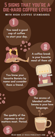
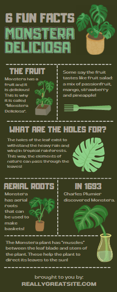
Informational infographics
An informational infographic template is one of the best infographics for clearly expressing your message or communicating a new idea or concept. It helps to give an overview of a topic.
An informational infographic is divided into sections with detailed headers, numbering each section can help your infographic design flow better.
Most infographic designers agree that people tend to like infographics with numbers placed in the titles.
Here are a few informational infographic tips:
- Do your research
- Use visuals that match your message
- Make it memorable for your audience
Timeline infographics
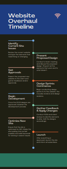
Timeline infographics are great for visualizing the history of something or expressing important dates of events, such as a project timeline.
Because people tend to make sense of time, a visual with a timeline format can help create a clear picture of different timeframes.
Visuals such as lines, icons, pictures, and labels can all help to highlight and explain points easier.
Here are a few tips for making a timeline infographic:
- Choose a timeline infographic template
- Create the framework for your timeline
- Add dates, text, and images
- Use color, fonts, and decorative graphics
Process infographics
A process infographic is a great template design if your goal is to:
- Break down super complex information
- Provide summary steps of a process
- Help your audience visualize a procedure
It would be best to use process infographic templates to help you explain different phases of a clinical trial or explore difficult concepts for the average person.
Here are some tips for creating a process infographic:
- Know your story
- Gather clean, easy-to-explain data
- Consider your headlines
- Keep it simple
Geographic or map infographics
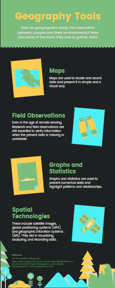
A geographical or map infographic is the best choice if you want to present demographic data or display location-based information.
The reason for choosing a map infographic for this type of graphic design is as follows:
- Because it helps illustrate trends in a specific location
- Helps you share visual stories of a place
- Communicates survey results or product statistics based on location
Here are a few tips for creating a map infographic:
- Choose a geographic infographic template
- Understand the usage of maps in geographical terms
- Use different types of charts
- Using icons in your geographic infographic template
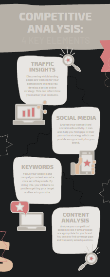
Comparison infographics
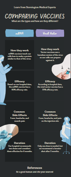
The comparison infographic is a popular infographic style that you see in many blogs, social media posts, and even emails.
It’s commonly used to help provide clarity when deciding between two different products or services.
It’s a good idea to use this visual element style if you want to:
- Encourage your audience to see different perspectives
- Compare pros and cons
- Show similarities or differences
- Display information in chronological order
List infographics
Studies suggest that the human brain loves lists.
Another study also suggests that the human brain is known to release dopamine when you achieve goals.
Because dopamine improves attention, memory, and motivation, achieving any goal with visual representation can have positive results.
With that said, infographics that are created in to-do list format can be a great choice for:
- Sharing a collection of tips
- Supporting an idea or a topic with points
- To summarize your presentation
Resume infographics
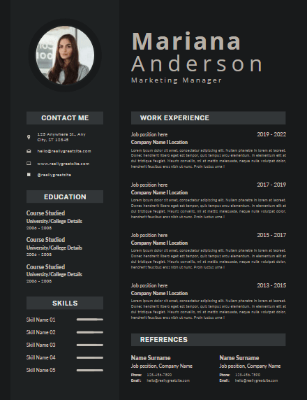
An infographic resume or sometimes referred to as a visual resume can help job seekers gain employment by showing their skills and experience in visual format.
A resume infographic is often used when:
- Someone wants to set themselves apart from other potential employees
- Catch the eye of a recruiter and leave a good impression
- Showcase specific sections of your resume such as certain skills, projects you’ve been a part of, and teams you’ve worked with
How Do You Make an Infographic?
The first thing you should focus on is how your template looks in a visual way. You should pick one that is appropriate for the data that you are representing.
The important part is to pick a template that specifically works with the type of data set you are trying to display. But, more on that later.
If you are choosing to use PowerPoint rather than a browser design platform, then a quick Google search will give you a list of free templates for you to choose from.
Here are a few examples:
Side-by-side comparison infographic

Side-by-side comparison infographic templates can help prove your point of view by comparison.
This type of design can help explain the key differences between two competing concepts.
Flowchart Infographic
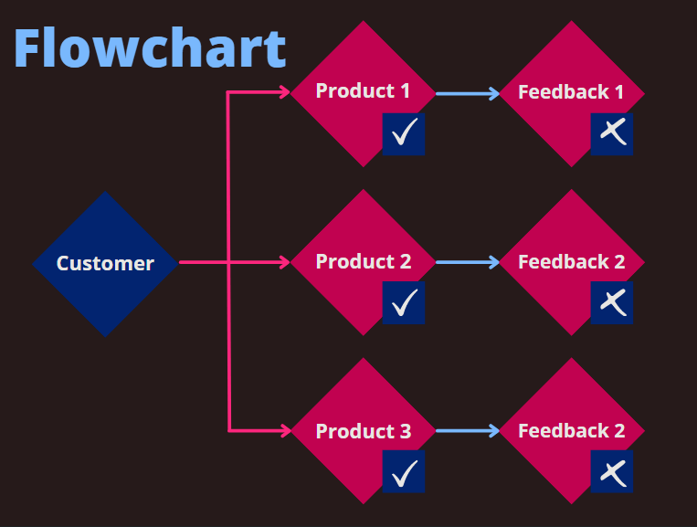
A flowchart infographic template design is good for presenting new workflows to your team members or your organization.
This style of design helps describe a process that may work across your industry.
Graph-based infographic
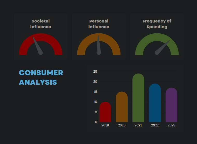
A graph-based tool is great for content creators who plan on publishing a high volume of data visualization and statistical information.
This is a great template to use for expert-level audiences as well.
Image-heavy infographic
Lastly, image-heavy infographics templates help you design content that reveals trends and information rather than just numbers and figures.
This type of design is particularly popular among content creators.
Here are some tips for creating your infographic:
- Identify the audience for your infographic
- Collect your content and data early on
- Cite your sources
- Customize your infographic
- Include footers, headers, and relevant font colors and sizes
- Include your logo and sources
- Add an embed code and social media button so it can be easily shareable
Best Infographic Design Tools
If you aren’t someone who creates infographics on a professional level, using Adobe Photoshop or Illustrator may not be the best choice.
Especially since programs like Photoshop and Powerpoint have a heavy learning curve and Adobe products aren’t cheap.
Not only does it take a while to learn the programs, but you may not have the technical hardware to run the programs such as a good graphics card or graphic drawing tablet.
If you’re just beginning to design your own infographics with little to no graphic design background, here are the top content marketing tools that make infographic creation easy:
Visme
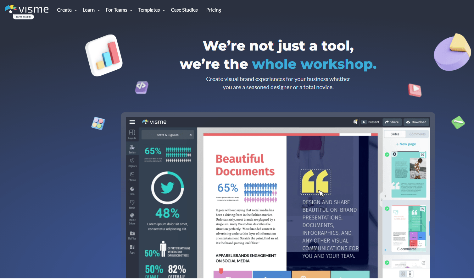
Creating an infographic with Visme is fairly simple.
You use customizable content blocks and edit them in the infographic section.
It’s a neat addition to the software because you’re able to adjust different pieces of content without changing the entire project around.
Visme is a great program because not only can you create professional-looking infographics, but you can make almost any other design.
Features it offers:
- Visual assets
- Templates
- Data visualization
- Brand kit
- Text and fonts
- Content block library
- Easy vertical adjuster
- Team collaboration
Venngage
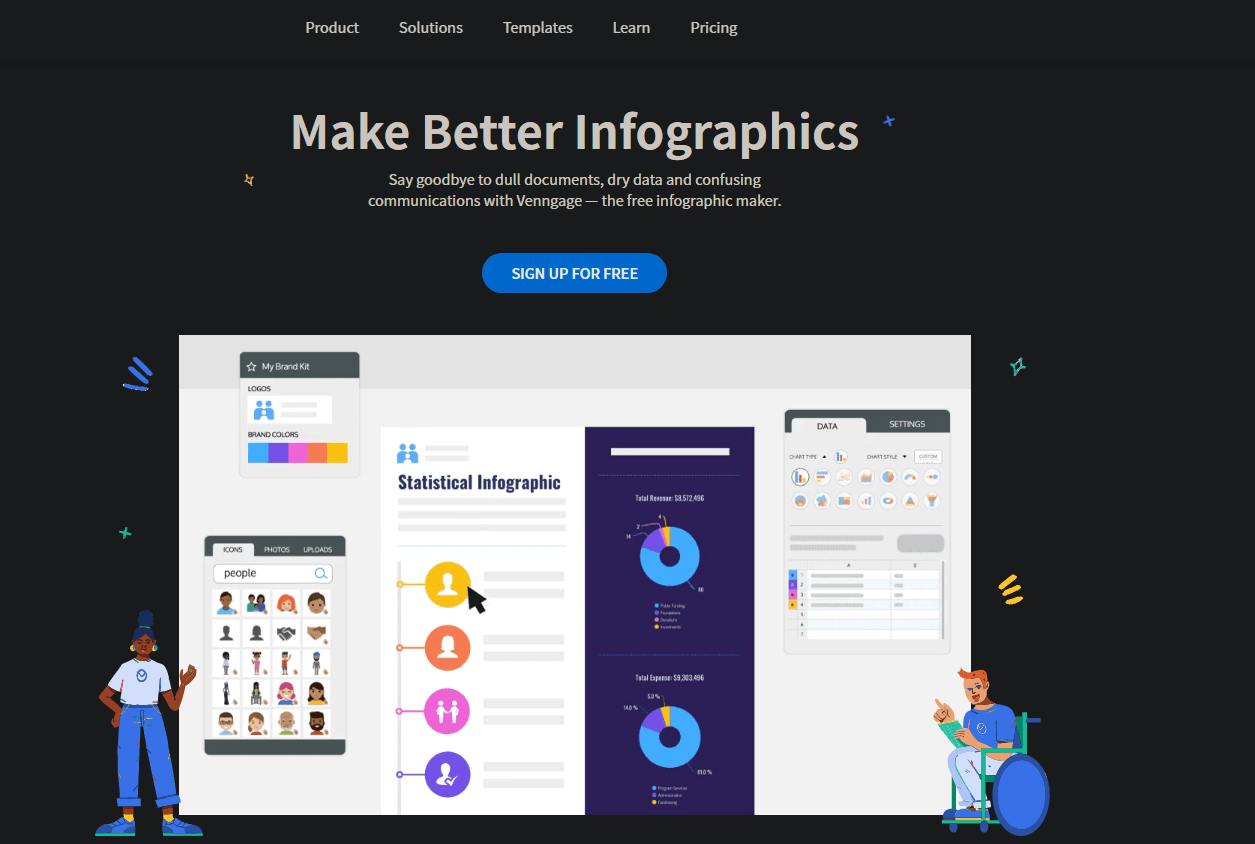
Venngage is a good tool to try out. They got started with offering infographic designs but have slowly expanded their templates.
Here are a few features their website offers:
- Visual assets
- Templates
- Data visualization
- Brand kit
- Text and fonts
- Team collaboration
Canva
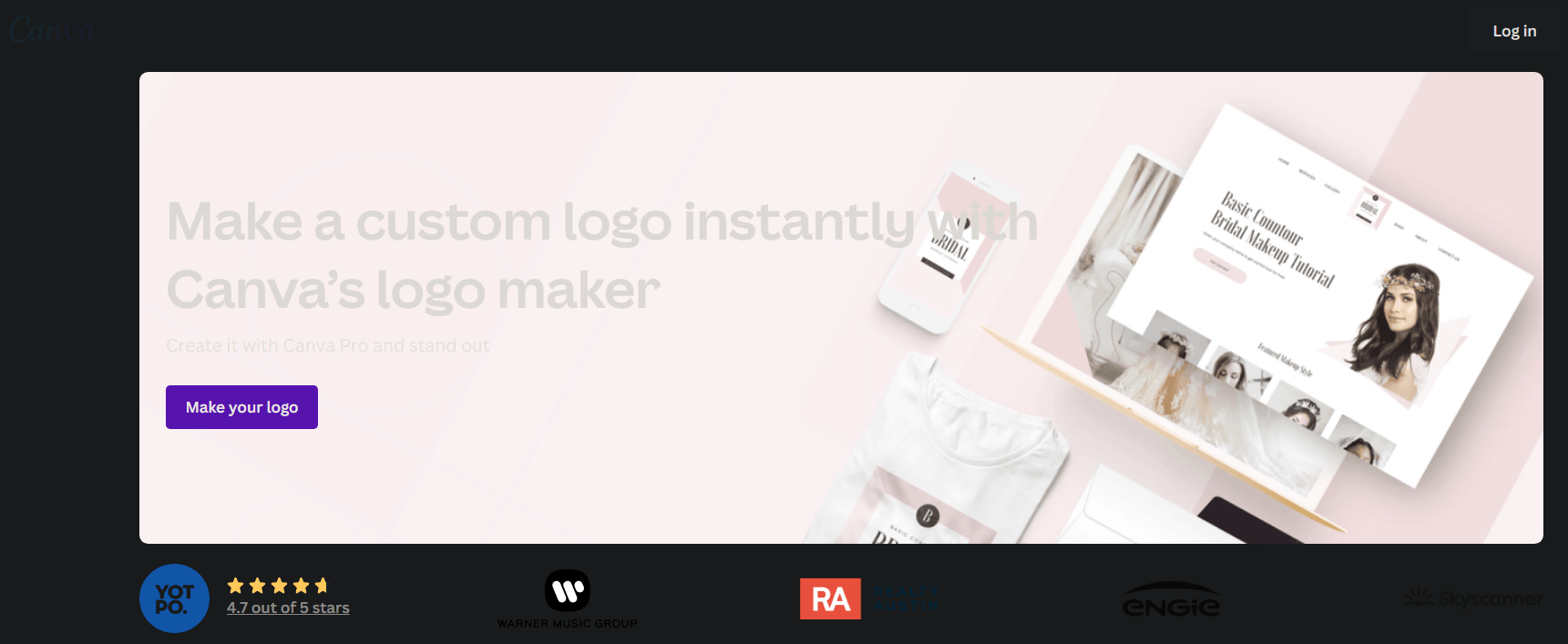
Canva is an all-in-one high-quality content creation tool. It’s actually considered by many to be one of the best infographic tools available right now.
Infographics aren’t the only template they offer, they offer social media post creation, video creation, animation, and even banner design.
Canva is one of my personal favorites and can be used by beginners and pros alike.
Features Canva offers:
- Visual assets
- Templates (but you can also create your own)
- In-depth design details
- Text and fonts
- Team collaboration
Piktochart
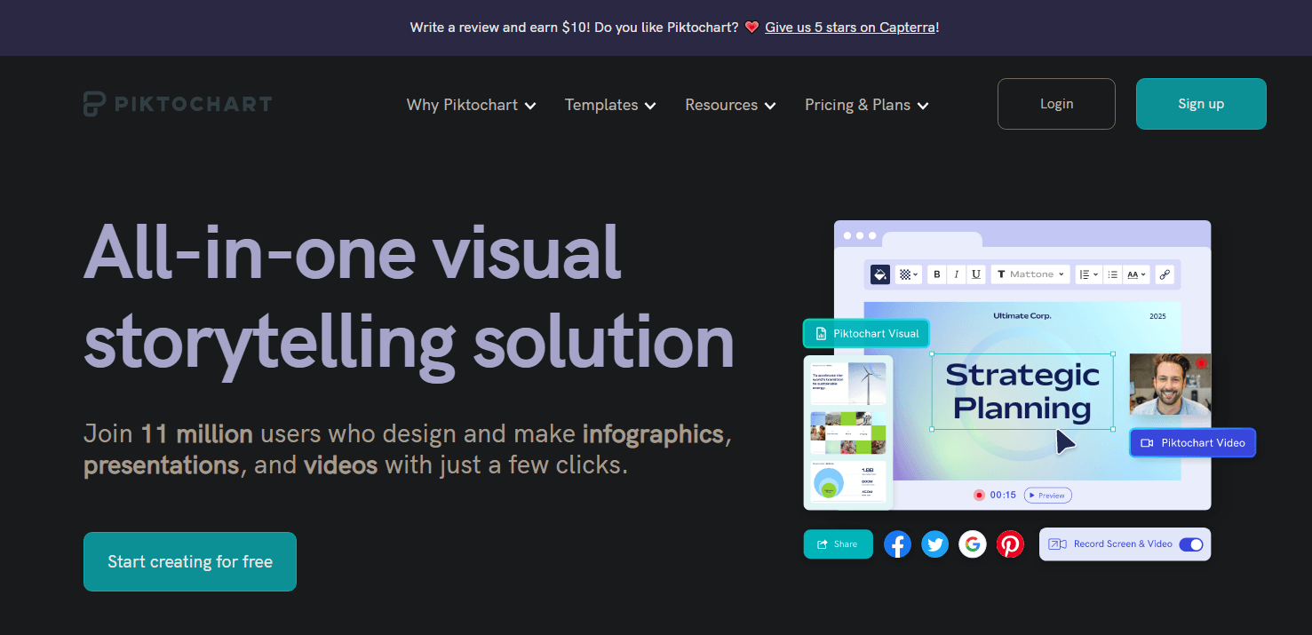
Piktochart is an awesome tool that is geared towards mostly infographic creation and design.
Unlike many tools on this list, Piktochart is more similar to Visme as to what they offer businesses.
Other tools can sometimes be for more blogging and social media purposes, but Piktochart has been a long-standing favorite for infographic creation and is often up to date with popular graphic design trends.
Features Piktochart offers:
- Visual Assets
- Data Visualization
- Text
- Adjustable Content Blocks
- Design Components
Snappa

Snappa has a colorful and unique approach to designs and offers mostly social media graphics, however, there are some infographic designs and it might be worth trying out if the above tools aren’t giving you what you’re looking for.
Features it offers:
- Visual Assets
- Data Visualization
- Text
- Background Remover
- Buffer Integration
Infogram
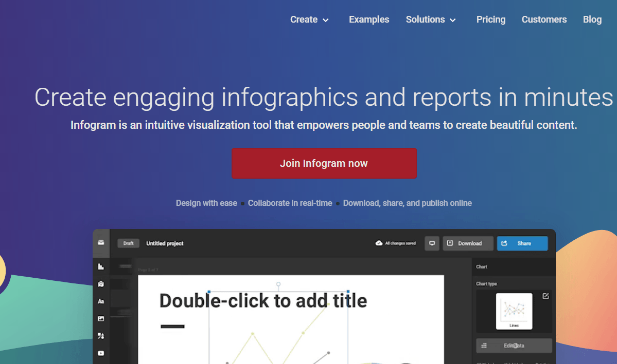
Infogram is mostly used for data visualization. Their key offers are about charts and elements to visualize any type of content. Apart from vertical infographics, they also offer social media templates.
Features it offers:
- Visual Assets
- Data Visualization
- Text
- Interactivity
- Elements
That’s All Folks!
Understanding the types of infographics can help increase your brand awareness, SEO efforts, online visibility and so much more!
And The HOTH now offers infographics as part of your HOTH X managed SEO campaign.
In fact, the majority of marketers are expected to rely heavily on visual content in 2022.
Need a little help with all this?
We got you!
