When you are running an online business the most important thing that you have to pay attention to is conversion optimization. The final goal is that anyone that lands on your website buys the product or services that you are selling. Unfortunately, things aren’t so simple and there are many steps in between.
First, someone comes on your site, reads some content, then it may need a few more visits until that person subscribes to your newsletter, and then through email marketing, you can get him or her to your sale page and convert them into clients that invest money in what you are offering.
Each step requires a new conversion. That’s why conversion optimization is essential to be able to maximize your chances of achieving your goal. To help you with this process, we hired Minuca Elena to make an expert roundup and reach out to internet marketing experts.
We asked them the following question:
What is the best way to get more homepage conversions?
We received a variety of answers that will help you grow your business. It doesn’t matter experienced online marketer or even a newbie, by reading this post you will understand how to design and improve your site’s homepage to convert at a higher rate.
-
Download the entire CRO guide from 89+ experts!
Let us send you the full guide and see what experts had to say on homepage, email, & sales page conversions.
Ann Smarty – Viral Content Bee

Last year I wrote a piece on how you can increase your landing page conversions by asking a question and I’ve seen this trick work especially well when it’s done on the home page.
Questions trigger that natural reflex in human beings forcing them to pause and find an answer. And in our cluttered digital marketing world, a short pause is usually all that’s required to get a conversion.
Take a look at socialtriggers.com homepage that utilizes the tactic both on the home page copy and within its lead-gen popup:
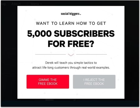
It’s impossible to say no to that!
It’s actually a very smart idea to re-enforce those questions by first using one within a copy and then asking a related one again in the lead-gen form. It’s called “foot in the door” tactic, leading the user down the conversion funnel. You can easily set up both (as well as A/B test) using already existing plugins and builders.
My favorite tool for niche question research is Serpstat which allows you to filter your keywords so you only see searched questions:
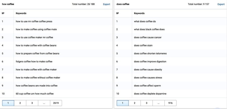
That’s a huge source of inspiration right there!
The bottom line: When working on your home page copy, use question research to get inspired and find a way to catch the user’s eye right away.
Patrick Langridge – Screaming Frog

Try to think of your homepage almost as a product or service page itself. This doesn’t mean make your homepage like an e-commerce landing page, but to ensure your homepage has a strong purpose and call to action as any good landing page should have.
As a user on mobile I always like floating menus and buttons for easy navigation, ideally with a CTA floating so there is always one on show, preventing an additional barrier to conversion.
Make it super clear to users what your business is, what you do and why they should buy from you or use your service. From my experience, I’ve seen far too many homepages that use confusing language which is often brand-driven and relies on users to know and understand your terminology.
In the case of most brands, users simply don’t. So ditch the buzzwords and focus on clear language which highlights your USPs.
Ensure your key product and category pages are internally linked to from the homepage. It’s important to signpost these key pages to users, to make it as easy and obvious as possible to get to pages which are likely to convert users.
Ron Sela

The ultimate goal in marketing is to drive conversions, which inherently lead to more sales, and larger profits. To achieve this, your website homepage is more important to your conversion rate than many people realize. Here are three tips to streamline your welcome mat to encourage visitors to come on in!
1. Use High-Quality Testimonials
Studies show that over 90% of online consumers read reviews before buying, with almost as many trusting online reviews as much as the opinions of their friends or family.
By displaying social proof on your homepage, your brand gets a seal of approval that first-time visitors take comfort in.
People need to be able to trust brands before they will buy. By using success stories and testimonials from happy customers, your homepage can become a powerful asset in the top of your sales funnel.
2. Use Conversion Components Above the Fold
Placing any form ‘above the fold’ on your webpage is more effective, as it instantly grabs attention before people lose interest by navigating around your site.
With a great conversion form above the fold that includes a high-impact call-to-action, visitors will immediately be drawn to your offer, before they even scroll down.
3. Explain the Benefits of Your Service Explicitly
Harping on about the features of your product will quickly deter prospects. However, if you tie the features to benefits they can relate to, then your conversion rates will improve.
Think about the “why” – why are people coming to your website?
By figuring out what they need, you can paint a picture of how they can benefit from your product or service, which will make the conversion so much easier.
Sam Hurley – OPTIM-EYEZED

My two primary methods to maximize homepage conversion:
#1: Personalization
But how do you personalize your homepage?
I use a combination of cookies, entry source and IP details to create custom messages to visitors…
My site uses Wishpond and its API (an Application Programming Interface) to provide website users with a tailored experience — which makes them feel part of something, rather than just a number.
It’s this positive feeling that encourages metrics like a 32%+ conversion rate for new subscribers.
#2: Chatbots
If you don’t use one today, you’re already far behind.
Chatbots serve two main purposes:
1). They increase website engagement and keep visitors (happily) on the site for longer, without 24/7 human interaction
and
2). They weed out time-wasters, while also quickly directing visitors who may have otherwise sent long questions through contact forms etc.
Conversational commerce is awesome for homepage interaction and conversion!
(The average time spent on my site is almost 8 minutes, across both mobile and desktop.)
Kurt Phillip – Convertica

It really depends on what your goals are and how much traffic is coming to your homepage. We like to follow the 80/20. On what pages do 80% of your conversions/revenue come from? We focus on this.
If you do have a large % of your traffic to your homepage, use this as an opportunity to direct users to an area of the site you want them to convert. Comparison tables work really well at this. Most people use them for comparing products for an amazon review site, but you can also use them to direct users to different areas of your website.
Bryan Eisenberg

Websites with high conversion rates from their homepage all have one thing in common. They build their reputation for the value they provide their customers.
Websites that have high converting homepages tend to see a lot of direct navigation traffic. That is, people who know the brand are typing their url in the browser, or visiting it from a bookmark on their computer.
The #1 secret of converting visitors, since I started helping businesses increase their conversion rates in the mid 1990’s, has been to ensure the people who bought from you once were so delighted that not only did they come back to buy from you again but they would tell other people (by reviews and word of mouth) that they should buy from you.
Secondly, many do a great job in their social channels demonstrating their values. Because of that brand storytelling, people are already pre-disposed to buy from their website when they get there.
Lastly, they do a great job reminding people once they get to the website of the value that they provide them. One of the best at this is Amazon, where repeat Prime customers convert at 74% of the time. Focus on providing value to your customers, be exceptional at delivering it and you can Be Like Amazon.
Kim Krause Berg – Creative Vision Web Consulting

When someone arrives to a website homepage they have 3 to 5 seconds to understand if the site has what they are looking for. It’s similar to when we walk through an indoor mall where each store has displays set up. Unless we see an item, or sign, or something that expresses the message, “We have what you’re looking for,” we keep on walking.
These displays are expertly prepared, from the lighting to product presentation to provide a compelling reason to enter the shop. They must also describe and target the type of customers they serve.
Address Your Target Market by Identifying Who They Are
Most homepages focus on what the company offers. There is rarely an expression of emotional depth or attempt to connect with the searcher.
Your website visitors want to be acknowledged. The best way to do that is to clearly address them. Your images should look portray people like them. Your text should be written with terms they understand. Content is less about “We”, “us” and “our” and more directed to specific users, offers, answers or solutions.
For example, you can write, “Cat lovers with finicky eaters may like to try,” and “For women over 50, this product repairs…”, “Home-based business owners on strict budgets chose…”, etc. The sentence identifies who the company is targeting, what they offer and motivates action (“try”, “chose”, “repairs”).
Performance and Inclusion
Connecting with visitors means knowing what computer devices they use and building an accessible homepage. There are an infinite number of environments and situations where mobile devices are used, so performance such as page load and layout of page content is important.
Inclusion design considers everyone, regardless of whether they require glasses to read or assistive devices to listen to the page. Conversions immediately increase by improving usability.
Who/Where/What/Why/When/How and A Verb
A homepage answers questions. It walks up to complete strangers in the hopes of having a conversation. I watch how people interact and try to emulate how we do that. We share information with people we trust, so design for credibility. We like to feel welcome, so address visitors by identifying them and showing them something you know they want to see.
We respond to action, so give your visitors something to do (buy, shop, read, follow, sign up, subscribe, order, find, explore, try, contact, watch demo, share, download, etc.) We have feelings, desires, needs, short memories or poor eyesight, so choose colors, words, images and layout that portray empathy and acknowledge the human being who has arrived.
Mads Singers Sorensen

A key aspect of good copywriting is to stop telling what you sell and start explaining what problem it solves.
I see it so frequently in the SEO and web dev industry where companies consistently are telling clients how many links they will build or the likes, but what they need to talk about (and sell) should always be the benefit the clients gets from the work.
As a client one doesn’t care what happens, but focus on the relevant result, that will help them change their business – Sell the vision, not the product itself.
Another key aspect of a good landing page is having testimonials – either video or clear testimonials linking to the LinkedIn profile or the likes, to make it clear it’s a review from a real person and not just any “Bob bobster” the site owner made up.
Bruce Clay

There are many obvious answers: increase traffic, have exactly what the visitor wants at an acceptable price, and nurture existing clients. Respond promptly, demonstrate concern, and speak their language sensitive to their needs.
But you can also build your brand and trust. You can be seen as the only top-shelf high-value solution to the visitors issues.
A conversion (or micro-conversion) can be many different things, and thus each is different. We believe that each site, and their competition, is a unique problem and that there is no one-size-fits-all conversion easy button.
Matt Diggity – Diggity Marketing

Homepage conversions are all about trust, credibility and quickly showing what it is that you do.
Most of the time, one’s homepage acts as a portal and is not optimized for any keywords.
Which means that people don’t have any specific search intent when they land on the homepage – They probably got there through a link.
The name of the game is to first make yourself look credible.
This all happens above the fold. A nice custom logo goes a long way.
“As featured on” logos and customer testimonials are extremely effective as well.
Step 2 is to tell your story. Let the reader know what it is that you offer in explainer videos, bite-sized paragraphs of your service and product offerings, etc.
Lastly, convert them. A strong CTA to your prime offerings towards the bottom of the page.
Warren Whitlock

The most important part of any conversion process (funnel) is how you set goals. Your goals need to work for the viewer. A clever piece of copy or graphic design won’t help much if you are not in alignment with the customer journey will drive people away. Design your site so that the viewers most important concern is addressed up clearly and then design their next step as something that you know will delight them.
If your viewers are returning customers, make it easy for them to login in and move one. For your new visitors, make sure you offer an easy next step that satisfies their most burning question (your top FAQ). Rather than close the sale, get the click.
Remember, customers need to go through a process. It’s obvious to us that we have a great offer, it sometimes take a while for them to know, like and trust what we recommend. Be consistent, reward them and they will move forward from the home page to whatever you suggest they do.
Melanie Nathan – Cheer Digital

I’m not sure if it’s the very “best” way to get more homepage conversions, but what I like to do is heavily research and find out all I can about my target audience.
I really try to understand and determine preciously what my audience wants and needs. If you’re unable to do this, I recommend hiring a professional to do it.
Knowing your audience, especially if you’re trying to sell something to them, is simply THAT important.
After that, it’s just a matter of developing a targeted sales funnel and also creating homepage content that satisfies and informs. Easy peasy, right?
-
Download the entire CRO guide from 89+ experts!
Let us send you the full guide and see what experts had to say on homepage, email, & sales page conversions.
Talia Wolf – Get Uplift

Start with the “WHY”. Why are people on your site? What was happening in their life at the very moment that brought them to your site?
When you can answer that question, you’ll have a much clearer understanding of what content and experience your prospects need from you.
People don’t just randomly end up on websites, we’re all Googling (or Binging…?) our way from problems, pains, and solutions.
Identify those pains, concerns, and hesitations your prospects have, and solve them on the page with the right copy, the right images, and content.
Best practices will only take you so far (not very far at all), if you want to increase your conversions dramatically you’ve got to appeal to people on the emotional level, understand their emotional-drivers and show them that you understand them.
Rather than focusing on the solution, you’re selling, its price or features, focus on the prospects and their intent. WHY did this person come to my site today? What is her biggest pain or concern? How can I show her that we’re going to solve that for her?
Minuca Elena

When people land on your site for the first time, the first conversion that you have to do is not to make them subscribe to your newsletter or buy your products, but to make them stick around on your site. If your site loads slowly, the visitor may not even wait to see it and he or she may click back. So, you need to have a site that loads fast, under 3 seconds.
For that, you should keep as fewer plugins as possible and resize and compress all the images on your site. There are many more things that you have to do to ensure your site loads quickly but these two simple things will make a big difference from the beginning.
Your homepage should answer one main question: What can your readers and future clients gain from you?
The focus should be one the client and how can he or she benefits from your products or services. For example, if you are a business coach or a fitness trainer, don’t state all your credentials on your homepage (you can do that on your about page).
Say how you can help people, how their life will look like after working with you, like “you will get more clients” or “you will lose 10 pounds a month”. Mention clear achievable goals. Make it easy to understand what your site is about even for a new reader.
If your brand is about you, your skills, and the services that you provide, then you should also include a professional photo of yours. If your business relies on the company you run, than your photo may not be necessary. For examples, on the homepage of a construction company would be more appropriate an image with workers building a house than to see the photo of the company owner in a suite.
Your homepage should also include testimonials. Some people, especially beginners, include testimonials from friends. Other have testimonials from only the most famous clients. Personally, I prefer to get testimonials from all my clients, no matter how famous they are.
Also, it’s best to include the full name, the photo and if possible the site of your client. If you provide services to other companies, then your industry may be smaller than you think. It’s possible that your potential client knows or wants to talk with one of your former clients about the quality of your work before making an investment. Even if most people will not do it, it’s still gives more trust to show you have nothing to hide.
Also, you should include some examples of your work, like pictures of your products, or before and after picturs of your clients (this works for makeup artists, plastic surgeons, anyone in the weight loss industry etc.)
James Jacobsen – iPull Rank

The key to increasing homepage conversions is to first have a strong understanding of your users and your goals. This can be achieved through various UX tasks, that include, but are not limited to: User testing, user research, surveys, prototyping and data analyzation. Using these as a foundation, you can start to mock, implement and test. Many times, the most important items to focus on are:
- The pages CTA’s: Is the content, and the buttons/actions on the page clear and concise.
- Viewport: What content is important for a desktop user vs. a mobile user? How can these differing experiences be handled?
- Personas: Do you have multiple types of users? If so, is there a clear path set for getting each to the content that is relevant to them?
- Colors and type: How you handle color and type goes a long way in retaining users and getting them to the point of conversion. For example, if your user base trends toward senior age, having type that is too small can be a turn off.
While there is no cookie cutter route to increasing conversions, having a clear understanding of your users and using that to determine layout/content goes a long way to getting them from A-Z successfully.
Sam Soh

You need to have engaging content that visitors can relate to. For example, if you are using stock images, it is imperative to use photos that are of the same ethnicity as your target audience. At a glance of the homepage, the visitor must feel at ease and know that they have landed on a website that was created just for them.
In addition to photos, the content should also be as localised as possible. It might sound obvious but most of my content writers are not from the same country as my target audience. This additional scope of work to localise the content which you receive from the freelance content writers is very crucial for better conversions.
Daniel Christensen – Morningdove

The most basic way to increase your homepage conversions is by continually testing. This will show you what types of people are coming to your site and where they are clicking.
Ideally, you should have as close to ONE goal in mind for everyone who visits your site as possible – sign up for your newsletter, watch this video, read your blog posts, download your ebook, buy a product, etc. If you don’t, deciding this should become your top priority.
Once you have this goal in mind, all your copy, all your graphics, and all your CTA’s should be designed around it. I read once (about email marketing) that the point of the first line is simple: to get the reader to move on to the next line. The point of the second line is to get the reader to the third, and so on.
This is good advice for building a high-converting website as well. Create a hook so that visitors will stay on your site and work their way to your main goal. Get rid of anything that takes away from it. Even if a certain design element is appealing, you need to have the gall to delete it if it’s lowering conversions.
Brian Jackson – Kinsta

You should be sending traffic to landing pages or even your products/plans page. According to a study by Aberdeen Group Research, every 1 second delay in page load decreases customer satisfaction by 16 percent, page views by 11 percent and conversion rates by 7 percent. So one easy way to increase conversions is to ensure you have a fast and snappy website, whether this is your homepage or place of the conversion.
Here are a few tips to increase the speed of your website:
- Upgrade to higher-quality hosting. Don’t go the shared route. Make sure they have plenty have data center locations to ensure your server is closer to your visitors. This helps lower TTFB.
- Decrease external scripts and dependencies.
- Use a CDN to decrease latency and speed up delivery of assets further away from your hosting server.
- Optimize your images! A good rule of thumb is to keep images under 100KB a piece.
- Figure out what you can and cannot cache. Deliver as much content from the cache as possible.
- Go for premium DNS. Cheap DNS sucks. Although there are some exceptions to this such as Cloudflare.
- Offload heavy media when needed (videos, PDFs, etc.)
- Use a tool like New Relic to find out where the bottlenecks on your website are.
- Whatever you do, always optimize for mobile.
Mandy McEwen – Mod Girl Marketing

The best way to get more homepage conversions is to have a compelling call-to-action that provides massive, free value to your visitors. Having a good CTA with an awesome “freebie” is great, but that only gets you so far.
In order to entice your visitors to give you their name and their email address, there are a few things you should do first. To start, ensure that your “freebie” is targeted to a particular market, so you can speak directly to them and their pain points.
Sure, you’ll be getting traffic from various sources and not everyone will be your specific target market, but it doesn’t matter! Because ultimately, you can’t provide your product/service to everyone.
So, you should ONLY be concerned with visitors who fit the criteria of your target market and not worry about the rest. The next way to encourage people to give you their name and email address is to include testimonials on your homepage.
Of course, if you have testimonials from your ideal target market (aka your dream clients), then make sure you include those on your homepage so your potential prospects can identify with those individuals and start to get an idea of how you can help them achieve similar results.
Dimitar Karamarinov – onLoad Agency

When it comes down to driving conversions straight from your homepage, or the least, lay the path for success later down the road, you have to build and validate your expertise, authority, and trust while providing if not the best, the minimum viable UX to allow, or even best, push people to convert.
While there are a ton of variables and rules for the many niches out there, there are a few key factors that will make or break business for you.
Mostly accustomed to classic web development and SEO, the mix of metrics like FP (first paint), FCP (first contentful paint), FMP (first meaningful paint), TTI (time to interaction) have a key role in how and what perception users get from the very first moment landing on your website.
If you have your technology up to date, to design a loading experience that pleases the user is crucial to laying the path to success. However, a poor loading experience will not condemn you to fail, but it’s a rather great advantage, especially if used to your advantage.
Without getting too deep on detail, but the right mix of developer skills, design, and dark or grey pattern know-how could elevate the loading experience from an intro, all the way to leverage and even an accelerator to a sale.
Prioritize interactive elements or draw attention to any above the fold benefits that will build up your desired subconscious presumption.
It tricks such as sneaky design, misleading wording and muddled descriptions enriched with NLP techniques such as one my favorites, scaremongering, could take business and turnover to a whole new level.
If you combine those with the right dose of “baiting and switching” you could easily take the user to the next level where new traps await, such as a booking form (at best) or an evil-crafted landing page where you can further “push” to sell.
Although the line between conversion optimization and dark patterns is slightly blurry, to push for sales straight from your homepage is a challenging and ambitious goal which is far from impossible.
Alexis Pratsides – Mint Twist

No matter how much traffic your website gets, conversions are vital to ensure your business is profitable. Conversions occur when a desired outcome is completed through the action of a user, this can be anything from filling out a registration form to buying your content.
From my point of view, these are the main ways to increase conversions on your homepage.
- CTA buttons: These are more clickable than links, especially on mobile devices. CTA buttons should be tailored to your target audience. Consider A/B testing with the button colors as this can impact your performance.
- Testimonials: Visitors want to know if your website is trustworthy – testimonials do just that.
- Social media links/follower counts: These act like testimonials and show the authenticity of your brand.
- High-quality images: It’s 2018. Consumers value quality, and if your images don’t have it, why should your product?
- Video: Visitors want to know who’s behind your brand/website. Videos act as a great way to engage with an audience and to show personalization.
- Easy to scan content: People don’t have the time to sit and read through long paragraphs. Make sure your content is scannable, which can be done by bolding key points.
- Chat tools: Having a live chat feature can help your visitors engage more and resolve potential concerns.
- Above the fold content: Ensure the most important parts of your landing page are above the fold. This includes opt-in boxes or any other conversion element.
Your homepage is the beginning of the user journey, therefore ensuring it can get conversions is a must for all webmasters. The tips mentioned in this article are proven search engine optimization tactics that can help you convert, but at the same time increase your website traffic.
Hákon Ágústsson – My Twitter Alerts

DO CUSTOMERS UNDERSTAND WHAT YOUR PAGE IS ALL ABOUT?
Before starting a conversion optimization and A/B testing, it is best to know the opinion of users on your website.
There are some good tools for measuring the level at which visitors understand your page:
1. Session Replay App
With the use of session replay tool like Fullstory, any activity on your webpage will be recorded. You get to see how users uses mouse, scrolls, key press, and clicks on your page. You also figure out errors users encounter on your page.
You won’t be needing expensive tools, the free trial and free plan can be used for a start. It will be beneficial and fun to know the happenings on your page.
2. 5 Seconds Tests
People’s first impression on your site can be measured using usability tests to optimize the precision of your design.
You can show users five seconds screenshots (fivesecondtest.com) and ask them questions afterwards like:
– What is the company’s name?
– Opinion about the page?
– What product they think the company sells?
– Does the brand appear reliable?
When you understand the two tools that are explained above you will get valuable insights on how your customers behave on your website.
Johnny Baskin – Nomadic Advertising

If you want to increase your homepage conversion rate first you need to make sure you can track your current results properly. Use heatmap software to track user behavior on your site and make sure you have a way of easily split testing changes.
Once you have those elements in place it’s important to make sure your website evokes emotion through an enticing call to action and relatable images. Address any possible objections quickly.
Remove any unnecessary complexity and make it easy for users to follow your call to action. Users should be able to convert in as little clicks as possible without getting lost.
-
Download the entire CRO guide from 89+ experts!
Let us send you the full guide and see what experts had to say on homepage, email, & sales page conversions.
Dennis Seymour – LeapFroggr

It starts with identifying your main goal on the homepage.
– Do you want them to sign up for your newsletter?
– Do you want to segregate them to different “buckets” so your newsletter can be targeted? (You can do this within emails but some autoresponders cannot handle this function)
– Do you want them to contact you
– Do you want them to head on over to your critical content?
– Do you want them to check your about page first?
You can see where I’m getting to here. There are a bunch of things you want your visitors to do, but for the homepage, aim for just 1. The most important thing that will bring returns for you.
Ask yourself, “what’s the one thing that I want them to do when they land on the homepage?”
Once you answer that, you’ll be able to track conversions and setup better tests (like moving buttons, putting the form above the fold, etc) and that will lead to higher conversions.
Thank you so much to all the experts that contributed to this expert roundup!
If you enjoyed reading this article, help us spread the message about it, by sharing it on social media with your friends and followers.
Leave a comment