Ever notice how you can briefly scan most web pages to get the gist of what they’re trying to say?
Headings, subheadings, font size, spacing, bold, italics, and graphic design are all ways of getting the most important information to stand out.
That way, you’re able to digest the most important parts of a blog post without having to sit and fully read through it all.
This is known as a content hierarchy, which refers to placing more emphasis on the most crucial information in a piece of content than the rest.
It’s a timeless technique that’s used in not only website content but also newspapers, magazines, and print ads.
Why does this matter?
It does because the average internet user’s attention span is notoriously short.
That means your content hierarchy needs to be on point, with the most pressing information standing out the most. That way, a user will instantly be able to tell if your content sparks their interest or not.
Besides hooking your readers right off the bat, an effective content hierarchy provides a sleek, cohesive look for your website and can help boost conversion rates.
Does your website currently lack an effective content hierarchy?
If so, you’ve come to the right place. Read on to learn more about why content hierarchy matters, as well as how to form one for your website.
What’s Content Hierarchy All About?
Formally defined, a content hierarchy is a way of arranging a piece of content where the most relevant, important, or pressing information is the focal point.
In most scenarios, that means placing the most important information at the top of the page and less important information toward the bottom.
Besides the location of the content, design elements also come into play. For instance, you can highlight an important fact by formatting it in bold.
Headings and subheadings are also critical components of content hierarchy.
Your primary header (H1) needs to outline the topic you’re going to discuss, as well as why your users should care. In other words, what’s in it for them? How can reading your post solve one of their problems?
If your post is about learning SEO, an effective header will look something like this:
- How to Learn SEO for More Leads and Conversions
Not only does this heading outline the topic, but it also lets your readers know what they’ll get out of it (more leads and conversions).
Each subheading following the H1 should use the same template – with the most important subheadings appearing further up the page.
Other web design features that influence hierarchy include:
- Typefaces
- Fonts
- Bold/italics
- Spacing
- Colors
- Boxes
- Call-to-action buttons
- Images and infographics
These are all ways to separate the most important content from everything else on the page.
Generally, most websites place the most pertinent information at the top of the page while using boldface and other techniques to highlight CTAs and other crucial content that’s further down the page.
Why is your content hierarchy important?
All the written content you release on your website isn’t worth much if nobody reads it. Online content is oversaturated today, including blogs, ads, emails, videos, images, and infographics.
That’s led the average internet user to become a bit jaded when it comes to actually sitting down to read articles online.
Unless you want a sky-high bounce rate and dismal dwell time, you need to make sure your content has scannable text.
According to research by the Nielsen Norman Group, 79% of users scan a web page before deciding if it’s worth their time to read it all – and they bounce if it doesn’t catch their interest.
So if your content hierarchy is all out of whack, readers won’t be able to scan your articles, which will likely cause them to bounce immediately.
Yet, if your content contains the most important information at the top and contains scannable text elements, users will scan your article to see if it sparks their interest. If it does, they’ll stick around and read the entire post, boosting your dwell time.
Here are some examples of scannable text elements you can use in your hierarchy:
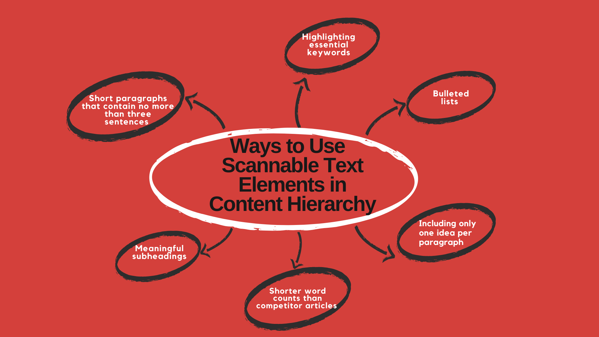
- Highlighting essential keywords (hyperlinks, bold, italics, colors, and typeface variations)
- Bulleted lists
- Including only one idea per paragraph
- Meaningful subheadings (avoid being clever here, get straight to the point)
- Shorter word counts than competitor articles
- Short paragraphs that contain no more than three sentences
- Inverted pyramid style – starting with the conclusion first
These elements will enable readers to scan your articles in just a few seconds, which will improve your user experience.
Internal Linking and Content Hierarchy
Besides the hierarchy of content on an individual page, you should also consider the hierarchy of your website as a whole.
In other words, your most important/valuable pages should hold more link value than less important ones.
How do you achieve this?
You can by using a logical internal linking structure to your website. That will help Google establish a clear picture of the hierarchy of your pages.
First, begin by creating a list of all your web pages, and rank them in order of importance. Your most essential pages should be your landing pages with the highest conversion rates, product pages, and educational blogs.
To assign more link value to one page over another, you need to provide more internal links for it.
To Google (and other search engines), the more links a page has pointing to it, the more authoritative it appears.
For the pages you want to have the most link value, make them your top priority for internal links. In other words, these are the web pages you should link to the most in your other content. Link to them on your blogs, homepage, about page, and other types of content.
That way, they’ll accrue more ‘link juice’ than your less important pages, forming a content hierarchy for your entire website.
Tips for internal linking structure
Visualize your entire website as a pyramid to make organizing your web pages into a hierarchy easier.
At the very top of the pyramid is your homepage, which is the hub where users can access all the content on your site (or they should be, you definitely don’t want to have orphan pages).
Beneath the homepage are sections and categories, such as:
- Landing pages
- Blog posts
- FAQ section
- About Us
- Service pages
- Product pages
Think back to the web pages that you determined were the most valuable in the previous step. That’s your cornerstone content, and it should be directly beneath your homepage in the pyramid.
Less important pages, such as your About Us page, can occur at the bottom of the pyramid.
Using contextual links
You should also make use of contextual linking.
What’s that?
It’s where you link articles discussing the same topic together. That will convey to Google and to your readers that the articles are all topically related.
Doing so is also how you show Google which articles are your cornerstones on each topic. These are the posts that contain the most detailed information on a subject which serve as the parent page for the related articles.
To point out a cornerstone article, link back to all your related articles within it (while also including links pointing back to it in the related articles).
Here’s an example using HOTH articles on link building:
- Parent page/cornerstone article: Link Building: The HOTH Guide to Getting Backlinks!
Related articles:
- What Is Link Building? (And Why Is It Important?)
- 4 Common Link Building Myths Explained
- Link Building for CBD SEO: Tactics to Get High-Quality Backlinks
- Local Link Building for SEO (5 Strategies for 2022)
As you can see, the cornerstone article contains detailed, general information about link-building techniques – and the rest of the articles go into more depth on specifics like link-building for local SEO and CBD SEO.
Google will notice this structure, and it will rank the cornerstone article the highest as a result.
Content Hierarchy & Visual Hierarchy: What’s the Difference?
You may hear the terms content hierarchy and visual hierarchy used interchangeably, but there is a difference.
Visual hierarchy refers to using visual elements to establish a hierarchy, such as text size, typefaces, colors, images, and other design features.
Content hierarchy is only focused on written content, such as including the most important information at the top of the page.
You’ll likely combine both techniques whenever you establish a content hierarchy, which is why the terms are so closely related.
Content and visual hierarchy techniques in action
An example of when the two converge is the primary header of a page.
The writer will include the most crucial message in the heading, and the designer will make it larger and a different color than the rest of the article, making it a focal point.
With the way our brains work, we’re trained to read the largest text first because it’s the easiest. Reading the fine print takes a lot more effort, especially if it’s lumped into large paragraphs containing more than five sentences.
That’s taxing on readers, which is why you want to write in shorter paragraphs with brief, concise sentences.
That way, users can quickly scan your web pages without missing anything important. If you have any important information on your website that’s written in a tiny font, you aren’t doing your content any favors, so make it larger.
Always consider your users’ needs when constructing a new web page by asking yourself the following:
What’s the most crucial message this post needs to get across? How can you make the copy easier to read? If you only want readers to retain one thing from your post, what would that be?
Knowing the answers to these questions will make it a lot easier to develop a content hierarchy that provides the most value to your users.
Google is watching, too
Remember that search engines also pay attention to the hierarchy on each page, not just to readers.
Just as Google can pick up on the hierarchy of your website as a whole due to your internal links, it can also infer which information is most important on each page due to its layout.
The better your content hierarchy, the easier it is for Google Bots to crawl and index your web page – all while understanding what your content is about and which information is most important due to the hierarchy’s structure.
The good news?
That means perfecting your content hierarchy will also positively impact your SEO and digital marketing efforts.
The Benefits of a Strong Content Hierarchy

Now that you know more about how to construct a winning content hierarchy, let’s learn more about the benefits of implementing and optimizing one.
Besides your website, you should strive to include a hierarchy for all the content you release outside of your site as well – such as social media posts on LinkedIn, paid advertisements, promotional emails, and other forms of content marketing.
A content hierarchy will not only help hold your users’ attention, but it can also provide the following benefits.
Improved dwell time and bounce rate
Two essential metrics for SEO (or finding success online in general) are bounce rate and dwell time.
What are those?
Bounce rate refers to how often users visit a landing page but take no further action before clicking away – which is known as a bounce. A high bounce rate means users aren’t interacting with your website beyond reading information on one page.
To increase conversion rates, you need to lower your bounce rate – and content hierarchy is a great way to do that.
With an effective content hierarchy in place, users will be able to clearly see CTA buttons and internal links to other pages, which will increase the chances of them continuing to explore your site.
It’s crucial to note that bounce rate does NOT include how long a user spends on your page. That’s a separate metric called dwell time.
A lengthy dwell time means that users are engaging with your content, especially if they’re informational/educational blogs. A short dwell time means that your content isn’t resonating with your audience, so it needs work.
With a proper content hierarchy, readers will be able to scan your article to see if they want to read it. According to the previous statistic, a whopping 79% of users do this. Once they finish the scan, they will decide to read if it’s intriguing, which will improve dwell time.
Builds a sense of trust and loyalty amongst readers
Implementing the traditional content hierarchy used by newspapers and magazines for centuries will build trust amongst your readers.
Strange as it sounds, we’ve become conditioned to trust brands that use this type of content format, as it’s heavily associated with newspapers and journalism – which most people consider trustworthy.
It adds a level of professionalism to your content that will reflect well on your brand. After all, who wouldn’t prefer to read a blog with a slick visual design that’s effortless to scan and read over an unstructured, incoherent mess?
There’s also a familiarity that comes with this type of hierarchy, which some readers may find comforting. It looks like all the professional pages they’ve read before, leading them to trust your content more than they would otherwise.
It creates a cohesive, universal look for your site
Today’s internet users are looking for a pleasant experience whenever they visit a new website. They don’t want to get bogged down by large clumps of text, slow loading speeds, and confusing interfaces that they struggle to navigate.
Using a logical content hierarchy will mitigate all those potential issues while providing a stellar user experience.
It will also help you refine your internal linking structure and main navigation bar.
If your content has a logical, cohesive flow, users will have an easier time retaining your content. It will also be easier for them to spot call-out boxes and CTA buttons, which can help expedite the sales process.
Developing future content is a breeze
Another perk of using a content hierarchy is that creating new content is easier. If you’ve ever started a blog post only to get hit with a severe case of writer’s block, this benefit will help you out a lot.
Instead of scratching your head in confusion, your content hierarchy will provide a guide/outline of sorts.
The framework will already be there, which types of headings and subheadings to use, as well as images, call-out boxes, and fonts – which removes a lot of the guesswork and can make it easier to write new posts.
It boosts conversion rates
All the benefits we’ve covered so far lead to better conversion rates. Since your content is scanner-friendly, readers that prefer to scan will give your content a shot, which can lead to them converting.
Not only that, but the cohesive layout will make it easier for users to spot CTA buttons and call-out boxes, making it easier for them to make a purchase.
Also, the heightened content output due to how easy it is to make new posts will help you generate more leads and conversions.
Final Thoughts: Content Hierarchy
A logical content hierarchy will make any web page, from e-commerce sites to standard blog posts, easier to read.
By using visual techniques to point out crucial information and including it at the top of the page, you make it easier for your users to scan your content, engage with it, and convert.
As such, implementing a content hierarchy should be part of your marketing strategy if it’s not already.
Do you need help developing a content strategy for your business?
Then don’t wait to check out our outstanding content creation services at HOTH Blogger. Our SEO gurus will help you reach the top of the SERPs, so make sure to book a call today.
Leave a comment