What if you could double your sales with just a few optimizations?
We rounded up 40 experts in conversion optimization to give us their BEST tips on cranking more sales out of your pages.
Let’s get into it!
What is the best way to improve sales page conversions?
Andy Crestodina – Orbit Media

Every sales page needs two kinds of content:
- Answers the visitor is looking for
- Evidence that we want them to find
When you mix these together, the page is both satisfying and compelling. But if you leave out answers to their questions, the page won’t satisfy their information needs. Leave out evidence to support your answers and your page is filled with unsupported marketing claims.
Once you have the content gathered together, your job is to lay it out on a page in the general priority that converts the visitor. The important questions should be answered at the top and the evidence that supports those answers should appear nearby.
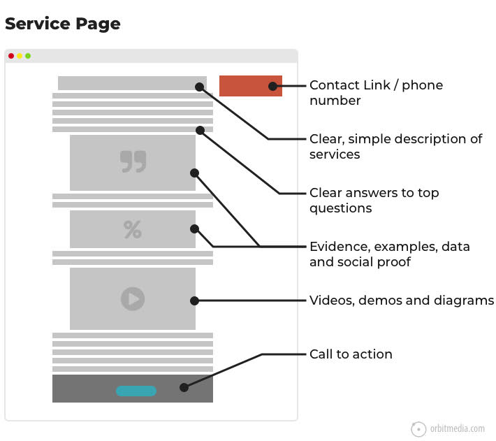
source: How to design a website, Orbit Media
The final step is to add a clear, compelling call to action. It can be specific to the page, rather than a generic “contact us for more information.” Remember, the visitor came to this page for a reason. When the call to action aligns with their reason for coming, you have a far better chance of converting them!
-
Download the entire CRO guide from 89+ experts!
Let us send you the full guide and see what experts had to say on homepage, email, & sales page conversions.
Dennis Yu

There is no magic bullet to improve sales page conversions– but here are the 3 most common issues we see that hurt conversions and are super easy to fix:
Use Google and Facebook re-marketing pixels— you spent all that money to get them there. Not even 50% of sites are doing re-marketing on both channels. And less than 10% are using Google Tag Manager to drive these pixels– it’s a free tool!
Video sales letters— tell stories, don’t just sell. Why use stock art pictures when you can have a video selling? No need for a fancy camera and videographer– your customers want to hear from you and other customers. 70%+ are on their phones, so they don’t care about 4K, anyway– plus it slows them down.
Make sure your sales pages load fast— most sites are 8-9 seconds. Test it with Google PageSpeed Insights to find out what to fix. Get Google AMP and Facebook Instant Articles going if you want to cut load times down to under a second. Ask your LP provider if they integrate.
Lilach Bullock

I don’t think there’s an ultimate solution for getting more email subscriber conversions; at the end of the day, it depends on your business and industry, your audience, and your overall marketing strategy. That said, one thing that works across the board is this: always offer value (a resource, amazing tips, great offers, and so on).
Personally, I’m a huge fan of targeted content downloads. The tactic is very simple: you create guides/listicles/etc. on your blog and you add additional resources that visitors can download while reading.
For example, it could be something simple like a PDF version of your how-to guide which they can keep forever, or it could be an additional resource, something that helps enhance the value of your blog post: a listicle with useful tools, a checklist, a swipe file, and so on.
Marcus Miller – Bowler Hat

I wish there was just a single way to improve sales page conversions but the reality is – it’s just not that simple. To improve results you have to first ensure you have a sales pages that tick’s all the right boxes for the product or service you are promoting. We want persuasive sales copy, reviews, testimonials and anything else relevant to your product or service.
Then you have to look at how you drive traffic to the page for an initial and subsequent visit. We have to think in terms of a sales and marketing funnel here and you may need to expose prospects to different forms of marketing to help build confidence and trust and get to the promised land.
Caveat aside, the following are five tactics from our conversion optimization playbook at Bowler Hat.
1. Traffic Quality – the quality of traffic sent to the page will have a strong association with the results. If your visitors all come from poorly targeted banner ads then your conversion optimization will be an uphill struggle. If your traffic is highly relevant and primed to buy then everything is so much easier.
2. Value Proposition – everything starts here. You need to understand your customer. We like the Strategyzer Value Proposition Canvas so we can really understand the pains, potential gains and jobs a potential customer can alleviate with your product or service. If we know what their problems are and clearly explain how our product helps solve these problems and help them achieve their goals then we are on the right track.
3. Bring People Back – once someone has viewed the page and left all is not lost. If that user was engaged they may well come back and buy – if you continue to convince them. Remarketing is your friend here and driving further visits and engagement with content and ads pushing the benefits (value proposition) then you will up your conversion rates over time.
4. Micro Conversions – maybe you can’t make the sale initially but maybe there is some form of download or something you can exchange for an email.
5. A/B Testing – experimenting with different headlines, copy, calls to action and design features can all have positive results. A recent client selling car finance had a scary red “apply for finance” button – simply changing this to green had a positive effect. A/B testing should be ongoing with at least a master page and one or more variations being tested to constantly test and improve results over time.
The important thing to remember is that each product, service, marketplace, and the customer is different – so you have to work with this mindset of constant iteration and improvement – that’s how winning is done. 🙂
John Rampton – Calendar

Track everything. So many people believe improving conversions starts with the best page in the world… wrong. You should first start with tracking everything on the page so you know what’s going on.
I track everything down to the color of a button and how it performs over a different color. Bright pink has been the best converting I’ve ever had on a website.
After you know what’s going on, you can start testing things!
Marie Haynes

I really feel that Google is doing all they can to algorithmically determine trust these days. As such, adding things to your sales pages to help inspire trust in potential users could possibly help you algorithmically.
For example, if you use personal information, share how you will protect that info.
Or, if you sell the same products as many other people, include a lot of information on why people should buy from you. Are you the industry leader? Have you won awards? Are people raving about your services?
If you can convince people that you are the best, then you’re likely going to increase conversions.
Dave Schneider – Less Churn

The best way to improve sale page conversions is through split testing. Of course, that assumes that you have enough traffic / conversions to do a proper test, however, if you don’t have that, then you have bigger problems 🙂
A lot of page builders have this functionality built in, for example, LeadPages. If not, you can use a tool like Google Optimize, which is free.
I recommend making big changes to the page, because the bigger the changes are, the easier it will be to have a significant test. Do a bunch of split tests, and you’ll have a good converting page!
Dominic Wells – Human Proof Designs

There’s no one way to improve a sales page’s conversions. What works for some sites isn’t going to work for others. The most important thing to do first is to get a benchmark to compare against, and then you can do some split-testing.
If you know your current conversion rate, you can test different elements to see what will improve conversions.
Make sure to leave a test running long enough to get valid results, and make sure to only test one thing at a time. Also, make sure you see the bigger picture and how the tests affect your entire funnel.
It’s possible for example, that you can make a change which gets more people to sign up, but fewer people to become customers further down the funnel. This is also why you need to leave a test running long enough before declaring it a success (or failure).
Ian Brodie

A really great way of improving sales page conversions that most marketers overlook (because they want everything to be hands-off and automated) is to have a live chat widget like Drift or Intercom on your sales page and to proactively pop-it open with a question after a couple of minutes of inactivity on the page.
The truth is that for a new sales page, many potential customers will have questions and concerns that the sales page won’t answer (yet). But they won’t take the time to proactively email or message you with them. So by opening up the chat and asking them directly if they have any questions, you do two things:
Firstly, you increase conversions by being able to answer the questions they have that are holding them back from buying and by building a personal connection with them.
And secondly, you find out what the common questions and concerns are so you can improve your sales page and make sure those concerns are answered on it for the next potential customers.
David Krauter – Websites That Sell

Believe it or not… all salesmanship aside… all the super-techy-latest-whizz-bang functionality on the market aside… making sure the core elements on a page are working and properly designed will give the biggest boost in conversions.
Doing the basics right ALWAYS delivers the biggest bang for buck.
Let me explain.
When we take on clients to increase their conversions many times their load speeds are terrible, their cart functionality is cumbersome or worse, doesn’t even work. There are no clear call to actions and no direction for what to do.
On top of that people forget how they are driving traffic. Driving traffic from Google should have a completely different landing page to that for traffic coming from social media such as Facebook ads. But this is already going a little bit advance… As mentioned above, mastering and making sure the basic functionalities work will provide the quickest boost in conversions.
These are basic elements that need to be mastered before looking at any fancy tools or conversion elements.
Here’s a quick (starter) checklist of the essentials for a converting page:
– Small logo (no one will buy based on the size of your logo, it’s the least important thing on the page)
– Phone number with a call to action.
– Easy ways to get in touch, inquiry forms buttons to contact forms.
– Calls to action where to go next, what to do.
– Fast Website Speed.
– Make sure buttons actually work and lead people to correct pages.
Steve Wiideman

The best ways we’ve found to improve conversions on lower funnel content include the following for e-commerce:
- Be touch-free or low-touch, using fields that include the autofill attribute (when possible) and appropriate keyboard specifiers for characters versus integers
- Always think mobile-first, using large tap targets and obvious call-to-actions
- Don’t make the user think; if they want to think, they’ll scroll, so have everything the user needs to see above the mobile fold line
- Remove the top navigation from the cart, but allows allow the user to “Continue Shopping”
- SSL compatible with the latest Mozilla and Chrome requirements is a must
- Try to get pages to load in under 2 seconds
- Offer as much unique content as possible, including high definition images, videos, and product reviews
For lead-generation:
- Don’t force the user straight into providing their information
- Ask a few Boolean questions and have a very short virtual conversation with the user to address their needs and to personalize the experience.
- Prompt for voice triggers to enable users who have Google Assistant or Alexa to take their engagement off the website to book an appointment or complete a simple action that may take more time via keyboard
- Compare the top 10 ranking pages, looking at every element that may be helping them drive leads, go back to archive.org and pay attention to what has changed over the years
- Use VisualPing to track changes to competing pages, why reinvent the wheel when competitors are already running the same tests you have in queue?
- Use JumpShot to track what keywords are producing conversions for your competitors and thread those search terms into your SEO strategy.
The most important activity any business can do to improve conversions is testing and experiments. UserTesting.com is a great source, as is Mechanical Turk. Be sure to have a large enough sampling of data before deploying major changes, as correlation isn’t always causation.
Allan Pollett

One of my first successful businesses online involved creating lead generation websites for the real estate industry. As an SEO specialist, I was very focused on driving as much traffic as possible to the sites. By ranking the sites at the top of the search engines, they were successful at getting lots of traffic. The sites ranked #1 for many of the most competitive real estate related keywords.
Even though I drove traffic, I wasn’t getting many leads if any. A typical site converts about 2% of its traffic into some kind of engagement: phone call, lead form completion, newsletter sign up or sale. My sites were failing. The problem was with trust.
The sites were generic and didn’t have an actual realtor on them. They were what they were designed for, to generate leads for realtors. To make them successful. I needed to change my model. Instead of generating leads for realtors the sites were reworked to focus on a specific realtor, whom I partnered with. By adding a person’s face and business address to the sites, the sites came across as more legitimate.
The trust was built and the leads started pouring in. People want to know they have come to a website, where they are dealing with a real person.
Building trust with your users is essential. So put a face to your business and built that trust. To take it even further add a video where you show the people in your company or have them demonstrating the products or services you offer. Pages with video covert 5 times higher than those that don’t.
Jon Tromans

Answering questions. Solving problems and looking at intent.
When someone arrives at your sales page there’s some sort of intent there, they want to do something. They may have a problem that needs solving by one of your services or like me right now need a curtain pole bracket as one has broken.
Use your titles, headings, and statements on the page to instantly answer these questions so for me I need to know curtain pole diameter and color.
Think deeply about what your customer wants from you and then echo this in your content. Make sure it’s to the point, easy to read with no distractions.
Finally, don’t forget your calls to action. More than one and in different styles. One may be a big button saying, “Get in Touch”, “Buy Now” or “Download”. The other could be a simple line of text.
When creating your page think about what your customer wants from you and then what you want them to do next. Make it easy for them.
David Leonhardt – SEO-Writer
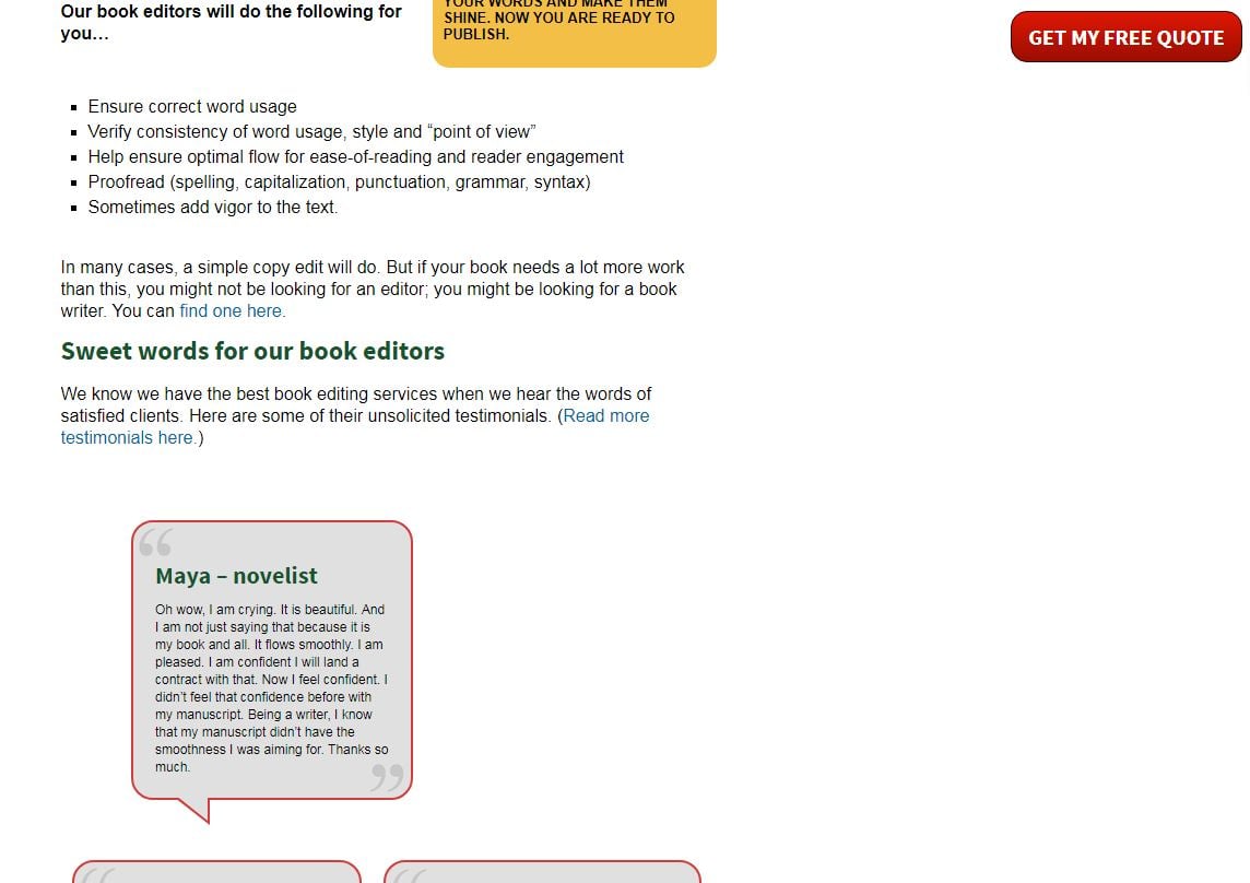
There are many great ways to improve conversions. The one I found the most useful has to do with my query form. When I first implemented a floating form, I noticed an immediate rise in queries, even though my traffic had not increased substantially.
A “floating” query form is simply one that is not fixed at a certain point on the page. In my case, it stayed (or floated) in the upper right corner of the visitor’s screen, like in this screenshot:
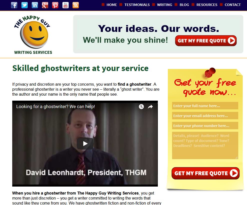
When I tweaked my template for better mobile performance, the form stopped floating. In its place, a red “Get my free quote” button appears in the upper right corner. It now floats there, even as a visitor scrolls to the bottom. Here’s how it looks now when you scroll:
What does this do, in practical terms?
It ensures that when an impatient visitor shows up, they can send a request immediately.
It ensures that when a cautious visitor shows up and wants to scroll a bit and read a bit, they can send a request without scrolling down or back up.
It ensures that people who like to read every last word can also send a request from the bottom of the page.
Bottom line: wherever a potential customer is, it’s easy-peasy to send a request for a quote.
And that bottom line helps my bottom line.
Chris Makara

While there are several things you can do to improve conversions, the best way is to test and make iterations of your page. Of course, you’ll need to have enough traffic to really test in order to reach significant significance.
There are tools out there that can help implement and monitor the test (some are free, some are not). Or you could also set goals and event tracking in Google Analytics to help monitor the results.
While some tests will not outperform the control, ideally you will continuously move forward to incrementally increase the overall conversion rate of the sales page which will ultimately increase your sales numbers.
Joel Klettke – Business Casual Copywriting

As much as I wish I could list off just one “super-tactic” for improving sales page conversions that worked every time, the honest-to-goodness truth is that no such thing exists, and the reality is a lot less sexy: the best way to improve sales page conversions is to do really really good research.
To improve a sales page that is underperforming, you need to diagnose why.
For example…
- Is the promise you’re making the one leads care about?
- Are you making it in a way they cannot ignore?
- Does your call to action meet them at their current state of awareness?
- Are visual elements adding or detracting from your ability to sell?
- Are you even speaking to the right audience?
And those are just a FEW of the things that could be going wrong! To lift conversions, you need to spend some time gathering qualitative and quantitative data: watch how leads currently behave on the page (what they read, ignore, skip over, revisit, etc.), look at the paths they take — and then cross-reference that with insight into their pain points, anxieties, desired outcomes, and priorities as communicated in their own words.
Whether it surveys, chat logs, analytics, recorded user sessions… the best thing you can do to improve conversions on a sales page is to consult your data!
Jose Perez – Emet Digital

Heatmaps and session recordings through tools like Hotjar or Inspectlet. Often, A/B & multivariate tests or any modifications to the page layout are implemented based on guesses and hunches.
Heatmaps and recordings show you how visitors interact with your page – clicks, hover areas, exit points, etc. – which enables you to develop a more solid hypothesis for your experiment’s implementation. This way, you’re already ahead of the game because your hypothesis is based on fact, rather than assumption.
These are some common flaws that I see in sales pages due to lack of heatmaps and session recordings:
- Focusing on tweaks above the fold when most clicks through to “See Pricing” or “Buy” happen in different areas of the page
- Copy changes in paragraphs that are barely hovered instead of focusing on the text areas that are indeed grabbing people’s attention
- Click gaps. Users hovering/clicking on some icons expecting to see tooltips, accordions or modals with more info
- Distracting secondary elements. The antithesis of the above point – people’s attention being diverted from the main CTA’s by secondary elements
- Poor experience in small devices. CTA’s being pushed down from above the fold, and oversized or barely noticeable clickable elements
While some of these points may sound intuitive for those of you who already know about sales pages’ best practices, I cannot overstate their importance. Relying on actual behavioral data can help you make the right tweaks to boost your conversion rate.
Pierre de Braux – Spiralytics

For sales pages, there are a bunch of elements (CTA, form, headline, etc.) that you need to continually test and monitor to maximize conversions. Best practices will differ depending on who your target audience is and how your business operates.
However, one thing that drives conversion rates up across the board is ‘trust’. If you can establish a significant level of trust with a prospect on or before landing on your sales page, there’s no question that conversion rates would improve.
Most of the time, when prospects are considering a purchase, they’re wondering whether or not to trust your brand as the best available option. Addressing their doubts at this stage acts to reassure them and make them feel more comfortable about making the purchase.
To build trust, your website needs to have trust signals. That means accurate contact details, verified partner and security seals, payment badges, customer testimonials, active social media accounts, and SSL certificates. Make sure you’re giving your prospects every reason to trust you and make that all-important initial purchase.
Sonja Jobson –Fresh Coast Creative

The biggest problem I see with sales pages is clutter. It’s natural to want to stuff a page with every tidbit of information you think a buyer might want to know, but information overload will kill your conversions. Simplicity will sell. Here’s a framework for deciding what belongs on your sales page, and what you need to nix:
Get their attention: write a strong, clear, and compelling headline. Make it big and bold. The job of the headline isn’t to be clever or unique, it’s job is to convince a visitor to stay on the page and learn more all within the space of a second or two.
Frame their problem: why do they need what you are selling? What will their situation look like if they DON’T solve this problem? Fear mongering tactics are no good, but framing the problem in a really tangible way so your buyer knows what’s at stake will increase their motivation to buy.
Offer the solution: present your product or service as the solution to their problem – not a just another product/service to consider. Use benefits and concrete details to help your prospect visualize how your offer can solve their problem/get them what they want.
Include Proof: Appeal to the logical side of your buyer’s brain by backing up your offer with solid proof. Customer testimonials, case studies, and reviews work great.
Calls to Action: Include bold, obvious buttons throughout your sales page (not just one at the bottom). Make your call to action descriptive “Buy Now”, “Get Started”, “Request a Proposal”. Don’t make your buyer work hard, make it easy to take action throughout your sales page.
Sotiris Sotiriadis – Realistic SEO

I was working with my team on redesigning the website of a woman offering dating advice/education. She never did any SEO to the website but she was getting a very good amount of organic traffic. So, she reached out to me to help her with the SEO.
The way that she monetized the website was by selling online courses on how girls can achieve in dating better men. While my team and were examining her analytics, we noticed that she didn’t have a good conversion rate. So, we suggested to her that instead of focusing on SEO to focus on building solid funnels to take advantage of the current traffic and then increase the traffic in order to get more leads.
We were able to come up with a custom WordPress design that offered opt-ins ins using attracting CTAs. We created site-wide header opt-in forms for her, set up a freebie so that she offers value to her users and voila! Since the day 1 of launching the website, the conversions were flowing in steady but not slowly.
My overview on this is.. In order to get more subscribers, you clearly need to offer attractive value adding freebies, such as a mini course or a real value adding eBook and make opt-ins as easy as possible.
-
Download the entire CRO guide from 89+ experts!
Let us send you the full guide and see what experts had to say on homepage, email, & sales page conversions.
Dai Carillo – PureB2B

There’s always been a debate between using a long-form or a short-form sales page. Both have advantages and disadvantages. Long-form sales pages are great for explaining everything about your product so there are more chances to convince them and they are beneficial for SEO. Short-form, on the other hand, converts visitors quickly.
The solution is to create a hybrid by putting all basic information and your most irresistible CTA above the fold. You can have a longer copy and more CTAs below that to explain your product or service.
A great example of this is Muckrack.com. From the first section, you already have an idea of their service/ product and two CTAs are available to target audiences on different stages (those who are ready to start and those who want to test the platform first). Below that are social proofs and a longer explanation of the platform’s capabilities.
Scott Fish – 32 Digital

The best ways to improve Sales page conversions:
Whether you sell a service or a product, there’s one thing that the person buying needs to feel in order for them to be comfortable making a purchase: Trust. They need to trust your business, they need to trust your product or deliverables, they need to trust themselves that they have made a wise decision. There are 3 ways to build trust in a sales landing page.
Let others speak to value. Reviews, Quotes, and other 3rdparty validating factors are a top priority for improving conversion rates. Look around at the sites you shop on, they’re filled with reviews – figuring out how to weave trust data into your product pages or sales page is important.
Show the value that your product or service creates. This seems easy, but selling without selling is difficult, but in doing so, you allow people to see the value (or hidden value for them individually).
Connect the brand to a customer’s experience. Getting personal improves conversion rates and if your customer has that moment in their purchase where they feel connected to the brand, it’s story, and what the product does, you will improve conversion rates.
Tim Brown – Hook Agency

The best way I’ve found to improve sales page conversions is by placing key visual indicators of trust factors the ideal customer cares out – in the proximity of the call to action button.
Whether it be publications your company has been featured in, testimonials with photos of the reviewer and 5-stars next to them, ‘fast and free shipping’, ‘made in the U.S.A.’ or whatever your particular demographic cares about the most – make them visual, and put them right next to the next step you want them to take.
In one A/B test I conducted I was able to increase sales 10k on the variant with ‘Fast and Free Shipping’ and ‘Made in the U.S.A.’ with little expressive icons placed right next to an add to cart button. Decrease friction, and give people an excuse to buy – it just requires a little bit of understanding of what their pain points are, and how you can alleviate them.
So dig into why people aren’t buying by talking with salespeople, and people who talk directly to the customers, as much as you possibly can. The more marketing people talk to salespeople, the better we get at actually showcasing the key differentiating features, and making the right selling points visual on sales pages.
Steve Kurniawan – Nine Peaks Media

In my opinion, the most important factor in improving sales page conversion is the value proposition, because of a simple reason: people don’t actually buy your product or service, but rather the benefits tied to it. So, properly communicating this benefit is essential, which comprises several different factors:
- Your value proposition must be well-developed and interesting, but at the same time, honest
- You should be able to properly communicate the uniqueness of your brand when compared to your competitors
- Your value proposition should be represented by all elements of the sales landing page: i.e., the design should represent the value proposition, the message is consistent, and so on.
In a nutshell, when designing your sales landing page, your main focus is how you can communicate the value proposition of your product, service, or brand.
Viktoriia Pavlova – Starlight

There is no “secret trick” that will help you boost your sales page conversion. It’s all about testing and listening to your website visitors. Here are a few techniques that will help you understand your target audience and adapt your web page design and content to convert them into customers:
User tests – this is the most powerful technique. Ask people from your target demographics to test your website and tell you their opinion. You will need to test it on at least 30 people to have a clear picture of what works and what doesn’t on your site. Based on the results, you can improve your websites design and sales copy.
Install heatmap – it will help you figure out where users click and how far they scroll down the page. It will help you to figure out where you should put your “buy buttons”, links or subscription forms to increase conversion.
Readability test – your website copy is the probably the most important thing when it comes to conversion optimization. You should use simple words and short sentences that users can understand without thinking much. Ask your target audience to have a glance at your website and ask them if they can quickly explain what it is about. And if they got it right, you are one step ahead of the competition.
After that, ask your audience if they find your sales copy appealing and whether they would buy the product/ subscribe to your newsletter. If they say no, investigate further what words and sentences made them feel this way.
Olesia Korobka – Fajela

Depending on the niche, you may have more or less mobile traffic to your page. The most common mistake that adversely affects mobile traffic conversion is when the page is built for desktop and then just resized for mobiles. That is, your dev just makes it fit a smaller screen but that doesn’t automatically make it convenient for the end-user.
For some industries, a more user-friendly approach is to start building your pages for mobile users first in mind and then extending it to a desktop version if a responsive design is an objective point. It is very important to test the pages loading speed on each type of device separately.
When the user gets to your sales page they should be already hot enough and they should understand right away that this page is the right one to make the purchase. Text should be sized big enough so that one doesn’t have to use a magnifier to read it. The images around the text should not be distracting. You can add arrows or image enhancements to make the user click the button or fill in information into the contact form.
It is better to provide a user with other options if they are not ready to make a purchase right away. Talk to them through some informational content, such as reviews from your other happy customers, videos or posts where it’s clear how your product helps to solve user’s problem.
Some users may need more time to consider. You can use a lead magnet with those users. You can offer them something they might need: add-on, checklist, e-book – in return for their email so that you could send them a few emails to remind them of your offer.
Melody Spencer – Swiftly Social Digital Marketing

To improve your sales page conversions I recommend keeping it short, sweet, and to the point. Remember, a good chunk of your potential clients will be using a mobile device.
Don’t make your page too long or to fancy. The ugliest, simplest sales pages tend to be the highest converting.
Also, be sure your images and messaging in all pieces of your marketing funnel align to increase the “know, like & trust” factor of your page.
Sameer Somal – Blue Ocean Global Tech

One major difference between a landing page and sales page is that a landing page doesn’t necessarily aim to sell. It could be used to achieve multiple goals like signup up for a newsletter or register for a webinar whereas a sales page is specifically created for conversions.
Below are a few considerations to increase conversion:
1. Build Trust to be an Industry Expert
An easy way to build trust with potential clients is to demonstrate your industry expertise by creating high-quality content.
2. Compelling (use another keyword) headline
Create a headline that visitors won’t be able to resist. The headline is the most read element on your page
3. Persuasive Call to Action button
Be clear and concise in your message that what you want visitors to do. for instance, you have a headline like this on your page “Create your custom designed logo for $50”
So your CTA should read like – “Create Your Logo Now”
Explore different CTAs to evaluate which performs best for you. Expert tip: Use multiple CTAs just make sure you don’t use too much.
4. Use Live Chat
The opportunity missed to engage is business lost. Having a situation where no one is available to handle customer queries, despite an “available” status showing on the chat box, leads to total failure and major reputation loss.
Natalie Athanasiadis – Ormi Media

The best way to improve your sales page conversions is to map out the action you want users to take before you start constructing everything. It’s a simple part of the process that gets neglected and then there is no real strategy behind the page which can really diminish your conversions. Ask yourself what specific action(s) do I want my users to take on this page?
By having a clearly defined goal every move you make, each call to action, every image or video and all of the content on page will be crafted to compel users to take that action! Remove any distractions that could cause users to click away and make sure your offer is compelling.
Business owners often think they if they tell users everything about their products or services that will be enough and if anyone is interested they will buy. Resist that urge to bombard users with additional information that detracts from the core focus of that page.
A sales page that is structured well, engaging, and easy on the eyes with clear calls to action and strategically crafted content is going to convert more of your existing traffic into buyers!
Craig De Borba – OnPoint Internet Marketing

How well your sales page converts have to do with many factors, some of which are traffic source and ad copy. But assuming you’ve got your messaging, ad copy and traffic source dialed-in the landing page copy and offers are the driving factors on-page. More than design, the offer made to the right audience will win every time.
What is the biggest boldest offer you could make? Make your offer so good that they’d be crazy not to take it and if the visitor leaves the page they’ll be kicking themselves for passing it up. Then make sure your page copy validates your claim and benefits by adding testimonials, case studies, and authority badges.
Make your copy very clear and concise with emphasis on the benefits and what problems your offer solves. Your offer is taking the visitor from where they are now to where they want to be (the more desirable condition), so highlight that and describe how that is. Visitors won’t read the entire page so use bullet points and lists for easy fast scanning for the reader, and emphasize core words that describe the new and improved condition or benefit they get.
Use imagery that connects with your audience on an emotional level. You wouldn’t want to put images of a male bodybuilder or female model in her 20’s when your product is for stay-at-home moms in their 40’s, identify with your audience.
Lastly, make sure your CTA is in a different color than other colors used on the page, you want that button to stand out amongst all the other design elements and the readers’ eyes to be drawn toward it.
Leonard Ford – Design Fire

One of the best ways to improve the conversion rate on a product sales page is to ensure there are no surprises to the potential buyer when it comes to cost. This can build trust and drive repeat sales. A good way to do that is to include shipping in the price of the product.
Consumers decide to buy a product based on the initial price they see. If they can justify that cost against the perceived value of the product, they are likely to click that buy button.
After they’ve made that choice, if they are then presented with a higher price due to shipping costs, they may re-think that cost vs. value calculation they made earlier. Including shipping in the price can greatly decrease cart abandonment rates for e-commerce shops.
The difference to a consumer of $25 plus $5 shipping versus $30 and ‘free’ shipping is enough to keep them moving down the funnel toward completing their purchase. It builds their trust that you have offered a product for a certain price, and that is indeed the price they are going to pay at the end. Building trust with the consumer is one of the key components to driving repeat sales. And we all know that it is less expensive to sell to a current customer than it is to acquire new customers.
Jason Scott – SessionCam

My number one tip for those looking to improve sales page conversion rates is the put the content that is most relevant to the user’s goals at the top of the page. As humans, we’ve have become notoriously impatient, especially when browsing the web. We want answers and we want them fast.
With that said, the content at the very top of the page is often the content that grabs our attention. By placing your most transactional content at the top of your page, you’re giving it the best chance of getting read by potential customers. I’d also recommend that you bear in mind your target demographic when deciding the type of content you’re placing at the top of your page.
Men tend to be more visual, whilst women seek information. Therefore, if you’re targeting one over the other, design your page accordingly. If you’re targeting both, make sure there’s sufficient content to impact everyone.
Don’t be afraid to experiment with images, videos, but make sure they’re good quality. Users can spot stock images from a mile off, so make sure your written content is accompanied by large, well-lit, high-resolution shots.
Gábor Imre – ROI Foundry

A perfect sales page must have a clear structure, brand-consistent design, great copy and its message should match with any search result or ad directing potential customers there.
The sales copy of the page is vital. Most pages only include some incentives, product features and CTA. It is also important to include product benefits: to describe the after-state the customer would like to be in (and can be with the help of the particular product or service) and emotionally connect with the potential customer via their pain points and needs.
The page should guide the customer through various stages: describing their problem, describing the after-state after solving their problem, introducing the product (with features and benefits, even step-by-step guides about the problem solving process if necessary) and providing proof (testimonials, reviews, social proof etc.), and only than directing them to the conversion point.
Chris Hornak – Blog Hands

The best way to improve the conversions of a sales page is first to create the page using a mix of research, best practices, and intuition. Then track and collect data to help you make smart decisions that will improve conversions and sales.
Before starting any digital marketing campaign it’s important that you understand your brand, it’s goals, and clearly defined target audience(s). You’ll also want to research what appears to be working or not working for your competition and use that as data before you have collected your own.
When creating the page you’ll want to start by hiring an experienced web development team who can help you navigate current best practices for sales landing pages.
You’ll want to listen to the web developers intuition, and they’ll need to look to yours as well. Combined you should end up with a page that has a strong chance of success.
Now that the page is up here comes the most over-looked phase. Tracking not only the conversions but other important signals that the page is or isn’t working.
One recommendation I give to businesses who want to know if their website is working is to apply a value to virtually every page of your website. By simply thinking about how much you’d be willing to pay per visit to that page. Maybe a blog post read is worth $1, but a sales page read is work $50. This method helps you start thinking about your visitors and content regarding value rather than metrics.
Eman Zabi – The Scribesmith

The best way to improve sales pages conversions is to hire a real copywriter.
Here’s my process: In my experience, the best copy usually comes straight from your target audience’s mouths. The trick is to weave in that consumer research with a benefit-focused copy.
I then identify pain points, magnify them, and then present your product as the only solution. And, then to really drive the point home? Paint a picture of what life’s like with your product in your prospect’s lives. Boom, your sales page’s now a lean, mean, converting machine.
You’ve got to remember to sell without sounding too ‘salesy’ though. Consumers can smell sleaze a mile away. Sound human, make them laugh if you can and clinch the sale by grounding your copy in research.
Ed Fry – Hull.io

Web pages are being left behind in a data-driven, real-time personalization world. When email, ads, live chat, sales enablement, and other channels are able to leverage lead & customer data to deeply personalize the way they engage, most websites show the same experience to everyone.
Poor sales conversions come from creating a poor, impersonal experience for your website visitors. The context to improve it comes from your data.
By syncing valuable data about a person into the page, you can personalize elements to tailor the copy, content, design & experience to them. For instance, swapping in their company name, logo, industry (and competitor) based testimonials, and so on.
Bring the same experience you’d expect from a good sales rep, not a generic send-to-all webpage.
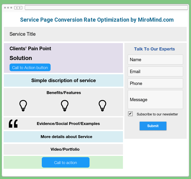
Dmitriy – MiroMind

Improving conversions on the page depends on your niche and industry. If you offer custom services and solutions to clients, like software development, marketing, design, or any other more hands-on services, then your sale funnel begins from the first time the customer reaches out for more information, quote or consultation.
Therefore, service pages more often than not target the ‘leads’, or users that reach out to them. To get more leads, your page needs to be well-optimized in line with the best CRO (Conversion Rate Optimization) standards for service pages. Although each industry is unique, there are certain ‘golden standards’ for service page CRO approach that are beneficial for most websites offering services.
1. Appealing design. Your design needs to be intuitive and appealing to your target market. Think about your customer and consider what the people you work with would consider appropriate. Firstly, your service page is the first impression of your company, it is a ‘storefront’ of your business.
Secondly, do not overdo with design elements. Your main priority is to not only make a visually appealing design, but also the one that any user will be able to navigate without even thinking about it. A good-looking website without clear instructions of where to click next is likely to miss out on potential customers.
2. Intuitive page layout. The page needs to be well-structured and follow a certain ‘path’ to lead a customer to a decision to reach out. First, interest them by outlining the issues they might have, or their ‘pain points’. Then offer a solution that will address these. Outline the benefits of your services as well as benefits of getting these services from your company (many years of experience, famous clients, money-back guarantee). Round it up with proof that your company is a trustworthy one by offering to view the portfolio or add detailed reviews about your services.
3. Have ‘buyer persona’ in mind. Converting pages are usually the ones that ‘speak’ to potential customer, addressing their issues and offering the right solutions. Consider the people that are visiting your service page and address the issues that are important to them.
If you are offering solutions for enterprises, then your content can either target big decision makers or industry experts. Decision makers are more likely to be interested in the benefits that your services will deliver to their company overall: time savings, cost savings, increased productivity and ROI.
On the other hand, industry professionals are more likely to be interested in more technical descriptions of your service. Aside from listing the benefits of your products, you need to address the pain points that your target customer might have. To address these points you need to have a clear vision of ‘who’ you are talking to.
4. Informative structured content. A lot of the times the service page is the first point of contact of the user with your business. Therefore you should treat it as such: the content has to explain both what you are offering and provide clear instructions on what to do next as well as provide benefits of using YOUR services. The content has to be organized and concise.
By quickly scanning through the content on your service page, the takeaway for your customer should be: what you offer, why your service is good for them, why they should choose your company and what they should do to get in touch with you.
5. Additional lifehack. After hundreds of optimized service pages we have noticed that adding a contact form on the right side of the service page increases the amount of leads. It does not mean the form replaces the CTAs, however we noticed that more people fill out the form which is right there in front of them instead of clicking on the Call to Action button.
6. Get creative with CTAs. Pay close attention to allocating CTAs: do not overdo it, but add it where applicable within the page. And get creative: while simple ‘Contact Us’ can sometimes do the trick, more appealing options that are in line with the rest of the content will get your service page more conversions.
7. Add visual proof where applicable. There is no better way to demonstrate your experience and expertise than showcasing the work that you have completed. Add examples of your work or before/after photos that will take your potential customer’s breath away. Having visual proof of the good quality solution to their issues will most certainly drive more leads your way.
Harris Brown – HFB Advertising

The best way is to do A/B testing.
The most important elements are above the fold of a sales page like the headline.
A compelling headline will grab the attention of your prospect to stay on the page.
From there you have:
• sub-headlines
• body copy
• photos
• colors
• layout
• fonts
• call to action
These elements are most likely the most important on the page. You may want to do bold, italic or a reverse knockout to make your message stand it even more. You want to capture the lead and not give away everything in the body copy.
I tell my clients’ all the time there is no magic pill that works optimizing and A/B testing all the time wins. Try a couple of options to start and then go from there. Soon you will figure out what works best.
Here is a bonus use a tactic like scarcity.
By doing this the human brain is outwitting you that once it is gone you can never have it again. We all want something that we can not have or don’t want to miss the opportunity. With these great sales page tactics, you will be on your way to capture great leads.
Craig Smith – Trinity Insight

Even though more consumers than ever are confident in using the internet, we are seeing an increase in customers who are nervous about making purchases online. Major retailers like Amazon offer free returns and an easy return process, and more people expect that wherever they go.
As a result, one of the best things retailers, Saas companies, and other businesses can do to increase conversions is to place clear policies on cancellations and returns.
For example, a travel website will say “free cancellation until X day,” removing the risk to customers. This way the customer makes a purchase then and there, rather than bouncing to make sure their travel plans are secured or until they want that room.
Not only does this increase conversions, but it also decreases marketing costs. Now that company doesn’t have to retarget that customer or keep marketing to them in hopes that the convert. The company’s efforts go elsewhere.
Almost any brand or industry can look at their sales pages and find ways to reduce risk, which is a major barrier that keeps people from buying from your brand. Offer a free trial, share your return policy, or promise a month-to-month contract.
When you lower the risk of buying your products or services, you increase the chances of a conversion from a new customer.
-
Download the entire CRO guide from 89+ experts!
Let us send you the full guide and see what experts had to say on homepage, email, & sales page conversions.
Andy Drinkwater – iQSEO

A sales page is the last hurdle in getting someone to actually convert from a visitor to a customer. But so many people bomb out at the last minute, unsure of their purchase for whatever reason.
There are so many strategies that you can employ to try and correct these issues, but I want to just talk briefly about the page layout on a mobile device – a huge problem for many.
If someone is landing on a sales page, then you need to remember that they have one small screen that should carry all of the information that they need. If they have to try and find it, then it is a stumbling block that you don’t need.
Three things to remember:
- When an item is added to a cart, make sure that the cart is visible on all pages. You should do this at the footer of the page.
- A complete summary of the purchase should preferably be on 1 screen/page. Try to reduce/remove scrolling.
- Include details about shipping and delivery times. Don’t make them click off to try and find this.
This is by no means an exhaustive list, but certainly a few of the issues that can prevent someone from making a purchase.
Thank you so much to all the experts that contributed to this expert roundup!
If you enjoyed reading this article, help us spread the message about it, by sharing it on social media with your friends and followers.
Leave a comment